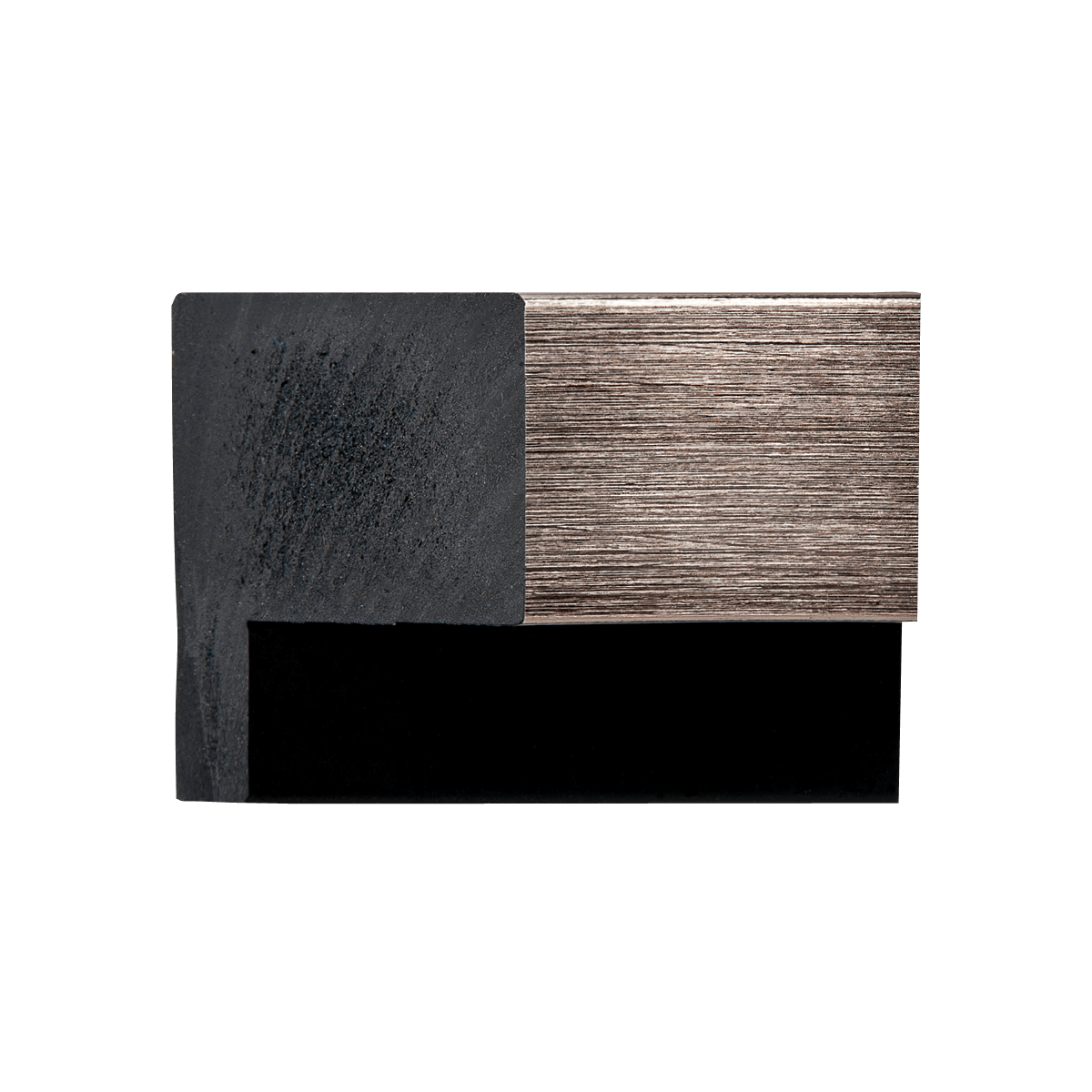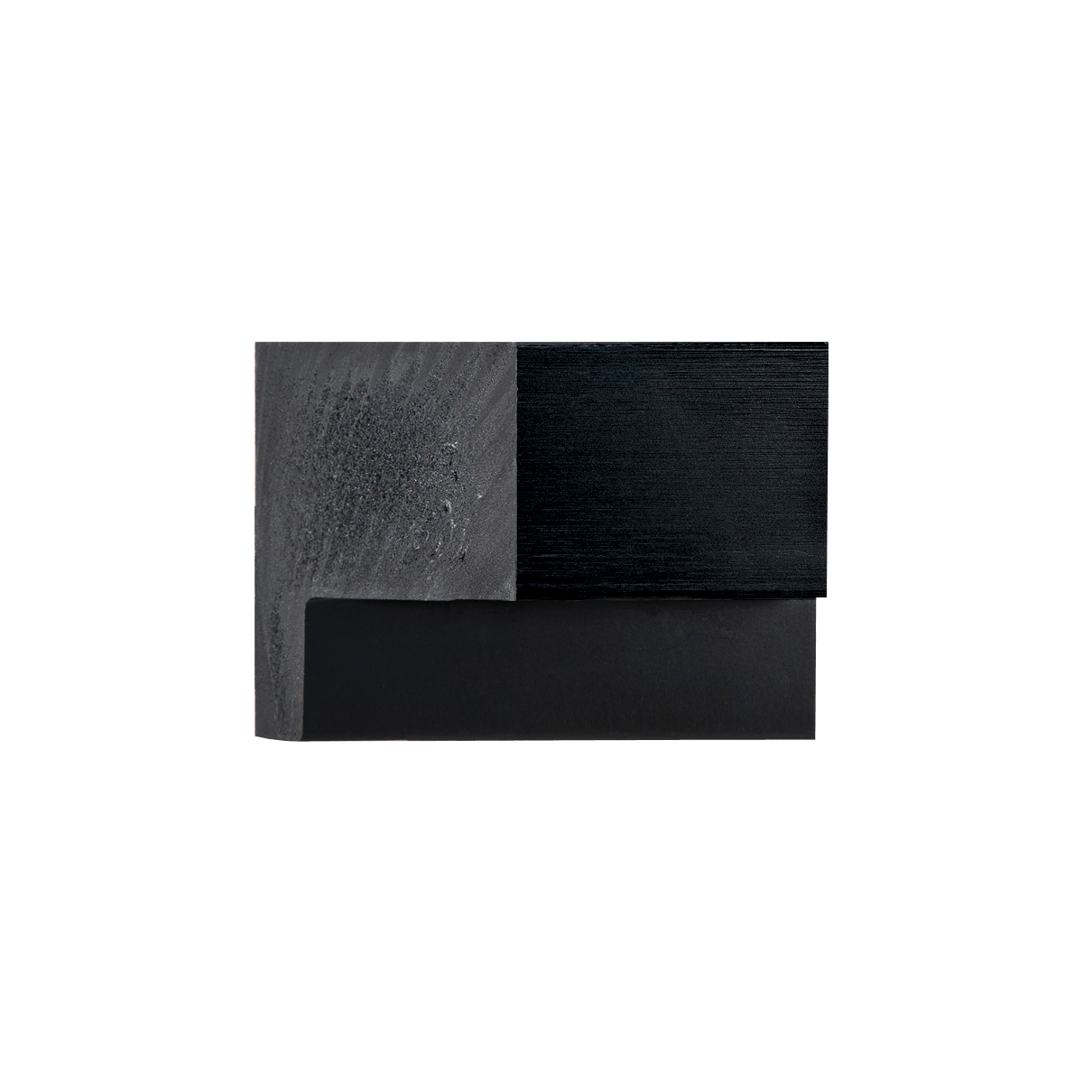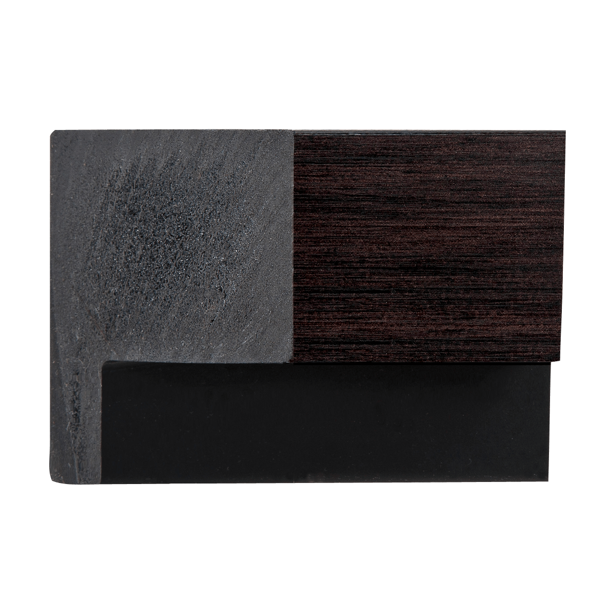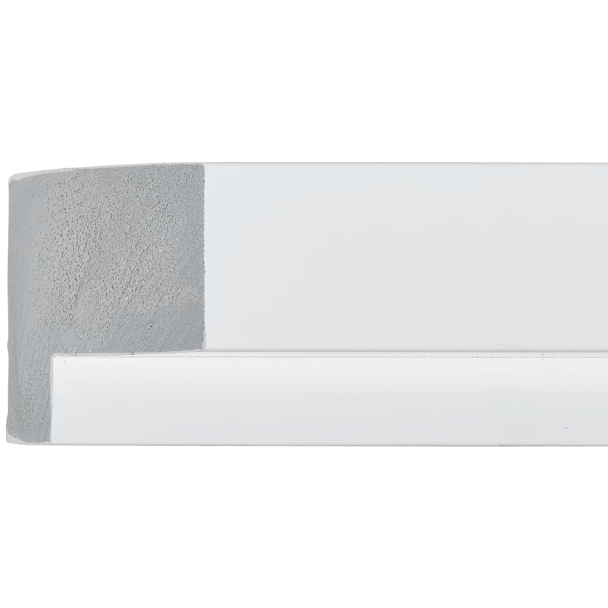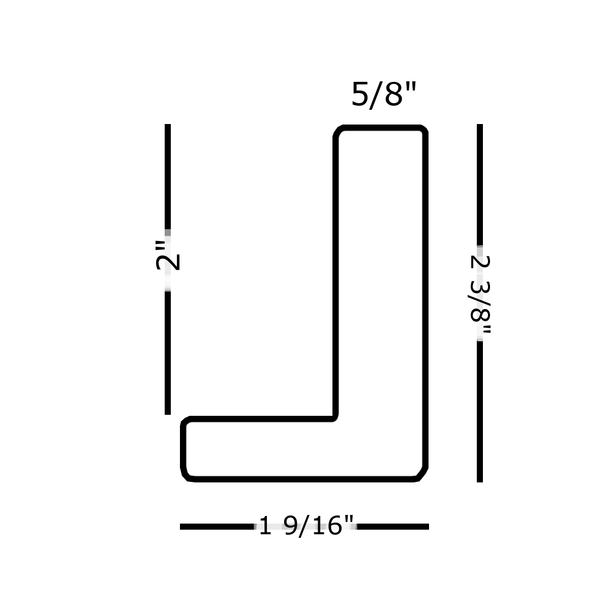
Floater
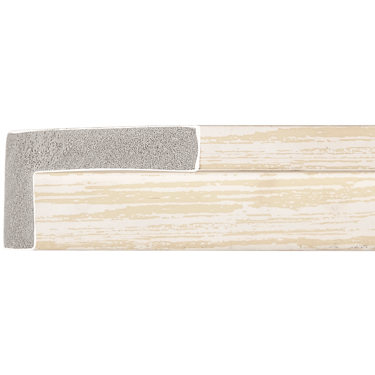
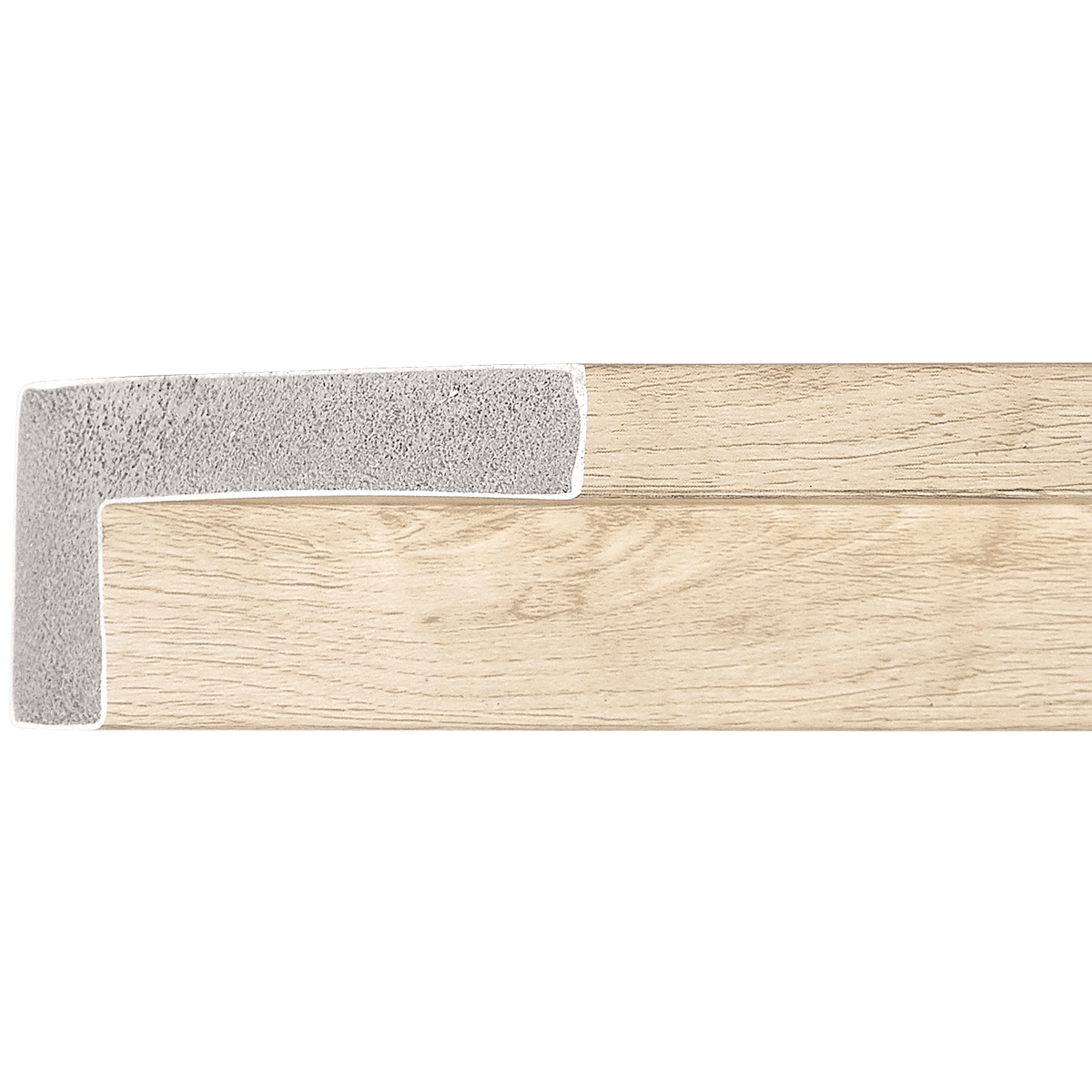
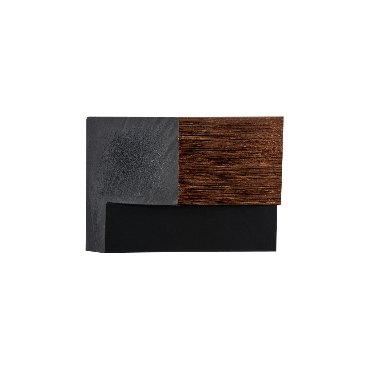
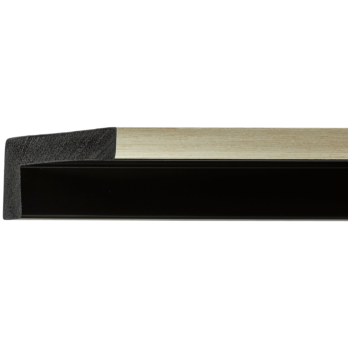
Gold Polystyrene Floater
EZR546
Contact us for pricing.
Specifications
- Frame number
- EZR546
- Category
- Floater
- Material
- Polystyrene
- Color
- Gold
- Width
- 1 5/8"
- Height
- 2 3/8"
- Rabbet
- N/A
- Feet per box
- 181
Easy Signs Inc. · Oakland Park, Florida
Visit our showroomThe perfect pairing
Artwork for EZR546
Absolutely, I’d be delighted to help you navigate the pairing of your EZR546 Floater Gold frame with the perfect artwork. This frame has a sophisticated elegance, thanks to its gold finish, which can elevate a variety of art styles. Here’s an expert breakdown to guide your selection:
1. Art Styles
The EZR546 Floater Gold frame complements a wide range of art movements:
-
Contemporary Abstract: The simplicity of a floater frame enhances the clean lines and bold colors typical of contemporary abstract art. Look for pieces that use striking forms and dynamic compositions.
-
Impressionism: Impressionist works, with their soft brush strokes and emphasis on light, can harmonize beautifully with the gold trim. Consider landscapes or cityscapes that capture fleeting moments.
-
Classical Portraits: Traditional portraits and figurative work will look stunning in this frame, providing a striking contrast between the contemporary framing style and classic subjects.
-
Photographic Art: High-quality prints or photographs, especially those with golden tones or rich color palettes, will resonate well with the frame's hue.
2. Subject Matter
Subject matter choices can significantly enhance the impact of your artwork:
-
Nature Scenes: Landscapes featuring sunrises or sunsets would pair beautifully, particularly with warm colors that echo the gold frame.
-
Urban and Street Photography: Photographs of lively city streets, especially during golden hour, can offer a modern twist that complements the frame’s elegance.
-
Abstract Compositions: Artworks that focus on forms or textures can provide an intriguing visual dialogue with the frame's clean lines.
3. Color Palettes
To create harmony and balance, consider the following color schemes:
-
Warm Tones: Gold is naturally complemented by warm hues—rich reds, deep oranges, and vibrant yellows can enhance the frame's appeal.
-
Cool Blues and Greens: These colors can create a beautiful contrast, especially when they are deep and saturated, invoking a sense of tranquility.
-
Monochromatic Schemes: Black, white, or grayscale images can create a striking modern look that emphasizes the frame without competing with it.
4. Medium & Texture
Choosing the right medium is crucial for optimal presentation:
-
Oil Paintings: The texture and richness of oil paintings will complement the frame, particularly those with thick impasto techniques.
-
Watercolors: Soft, fluid watercolors that incorporate gold or warm tones will work well, lending an ethereal quality that aligns with the frame's elegance.
-
Fine Art Photographs: High-quality prints on textured paper can enhance the depth of field and contrast beautifully against the frame.
5. Size & Proportion
When considering artwork size:
-
Artwork Size: Choose pieces that are slightly smaller than the frame’s dimensions to allow the floater design to shine. A good rule of thumb is to aim for artwork that is at least 2 inches smaller in both dimensions than the frame.
-
Matting Considerations: If using a mat, select a simple, thin mat in a neutral shade to avoid overwhelming the artwork while enhancing its presentation.
6. Specific Examples
Here are a few specific artworks or artistic styles that would be perfect for this frame:
-
“Starry Night” by Vincent van Gogh: Although classic, the vibrant blues and yellows would pop against the gold whilst remaining timeless.
-
“Water Lilies” series by Claude Monet: These serene, softly colored pieces would create a radiant effect, harmonizing with the frame’s elegance.
-
Contemporary Abstract Works by artists like Julie Mehretu: Her bold colors and complex forms would play wonderfully against the frame, making it a contemporary statement piece.
7. What to Avoid
To ensure the artwork and frame work in tandem, consider avoiding:
-
Dark, Heavy Frames: If the artwork itself has a very dark or heavy frame, it can clash with the lightness of the gold floater style.
-
Neon Colors: Bright, unnatural colors can be jarring against the sophisticated quality of the gold finish.
-
Overly Busy Patterns: Artwork that is too complex or cluttered may overwhelm the elegance of the frame and may not create the intended focal point.
By keeping these guidelines in mind, you will be well-equipped to select artwork that not only enhances the aesthetic of your EZR546 Floater Gold frame but also elevates your overall space. Happy curating!
Keep exploring