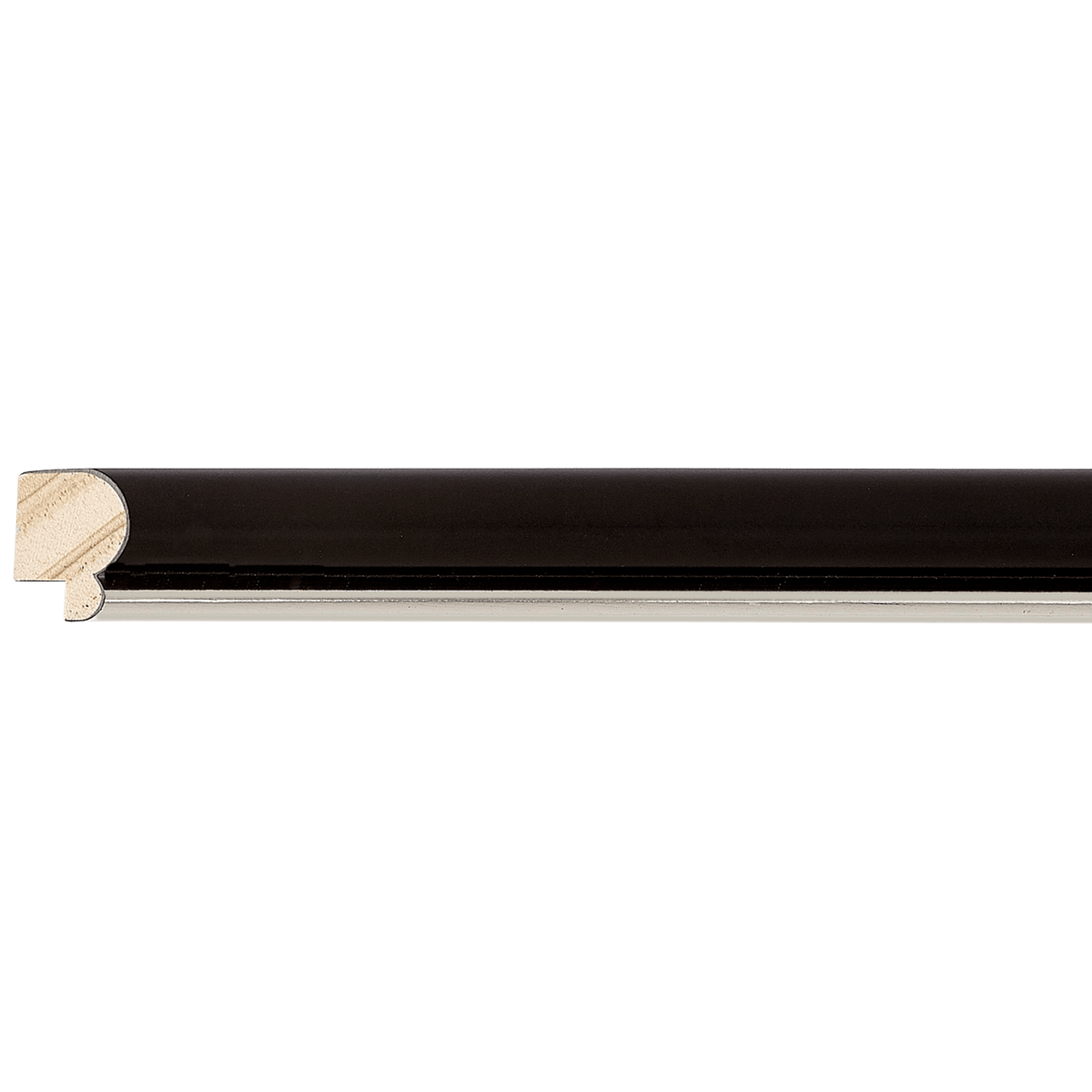
Moulding
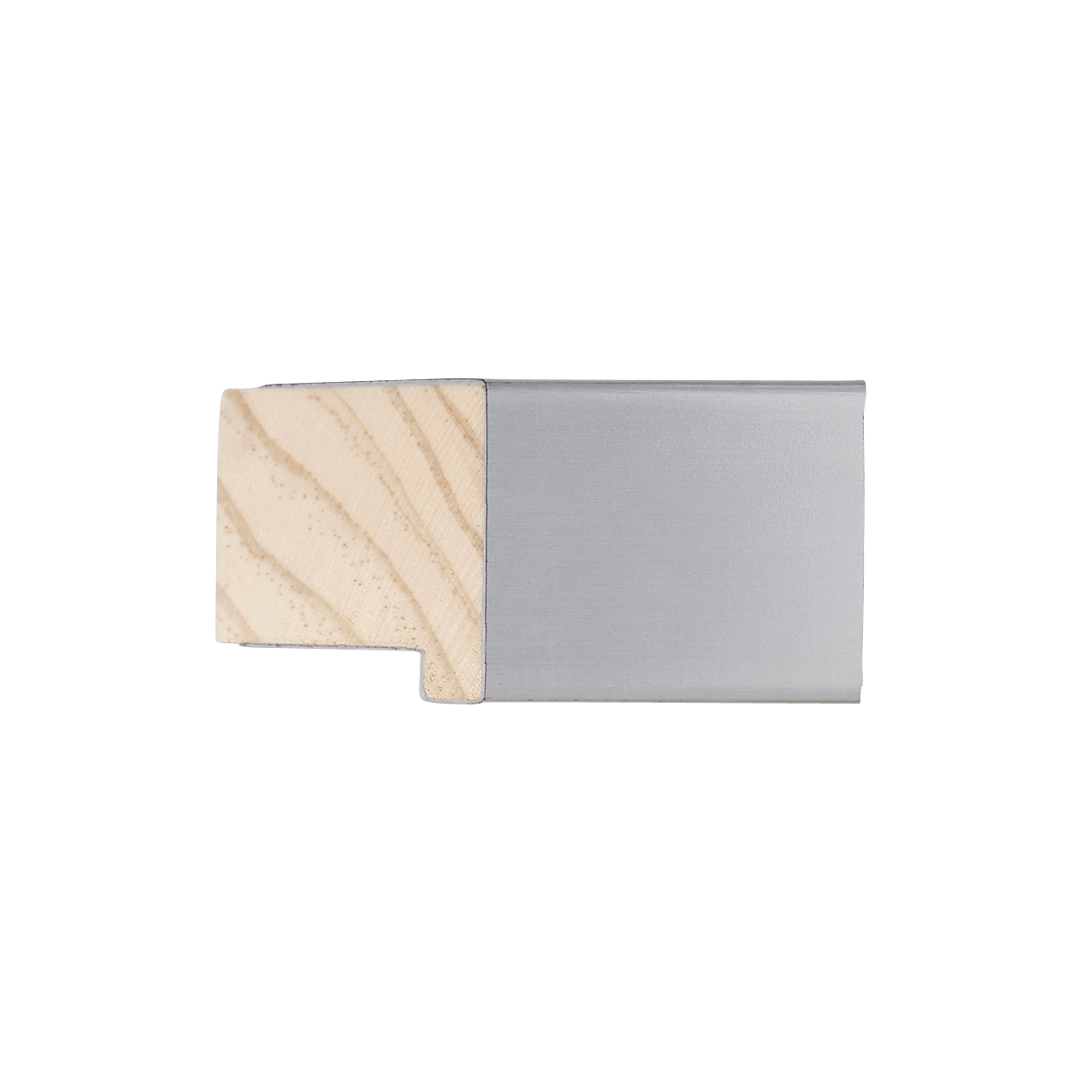
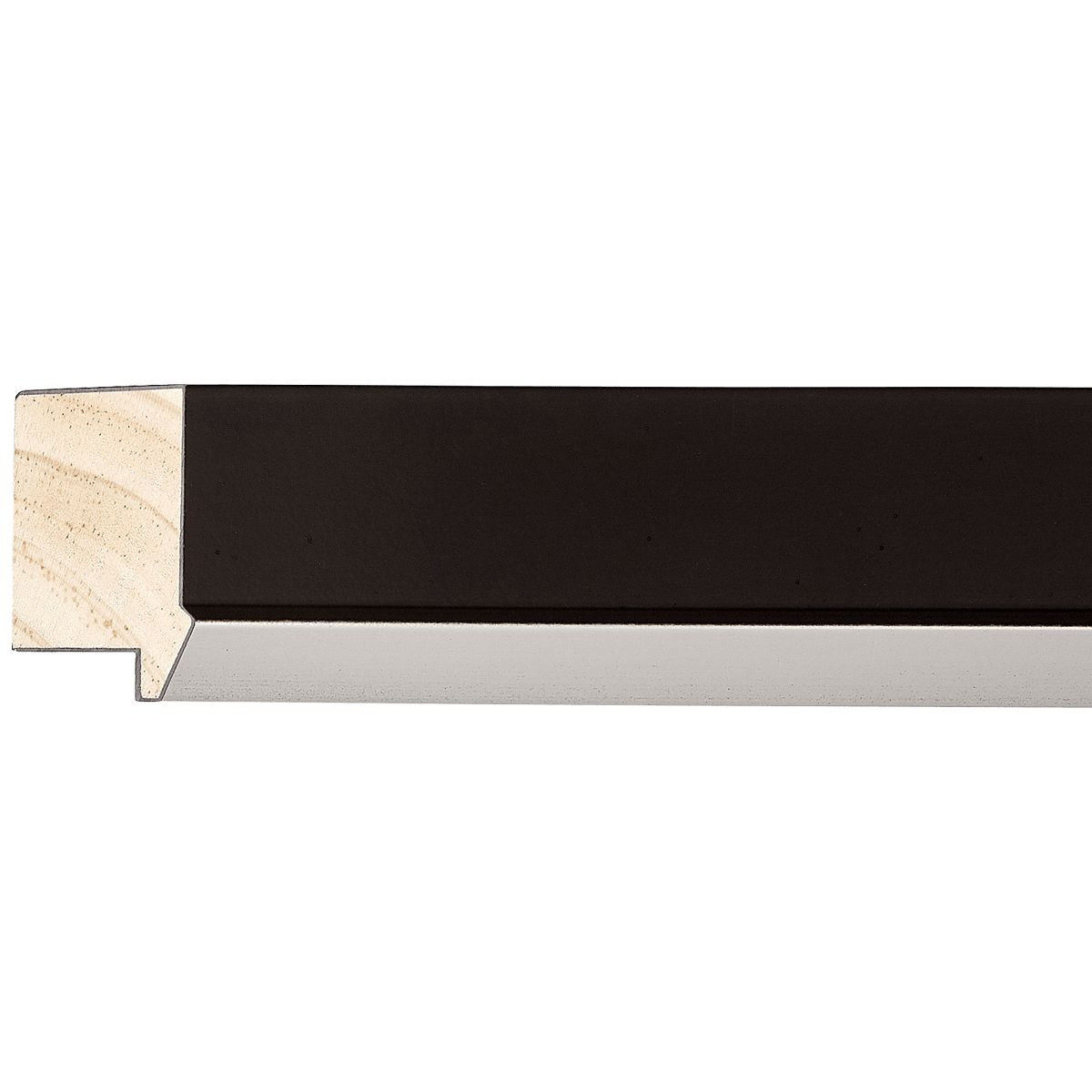
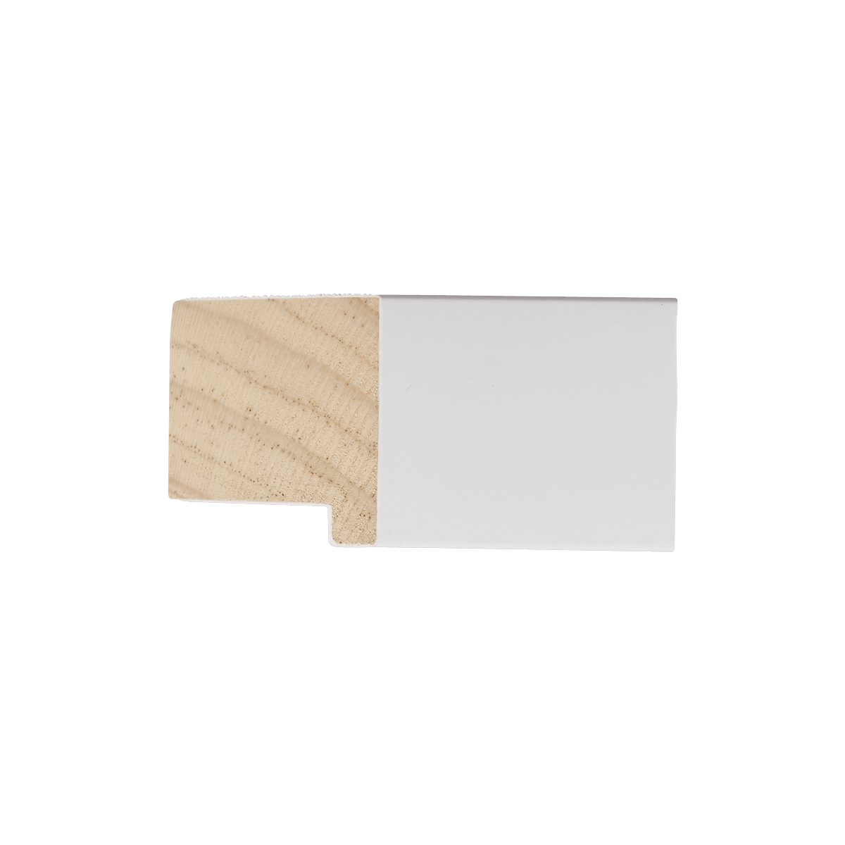
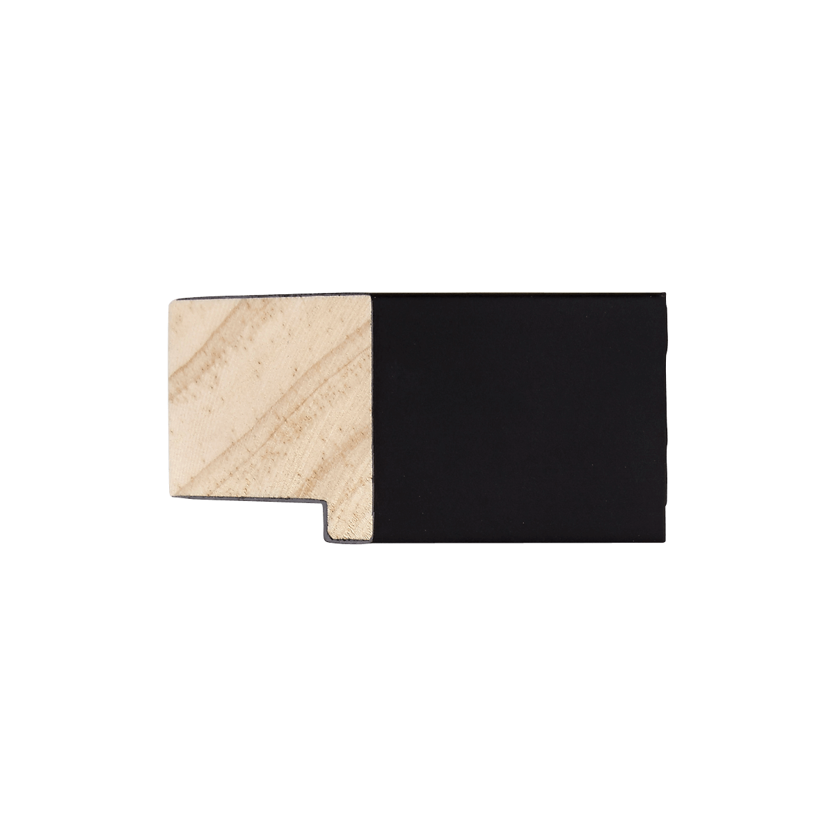
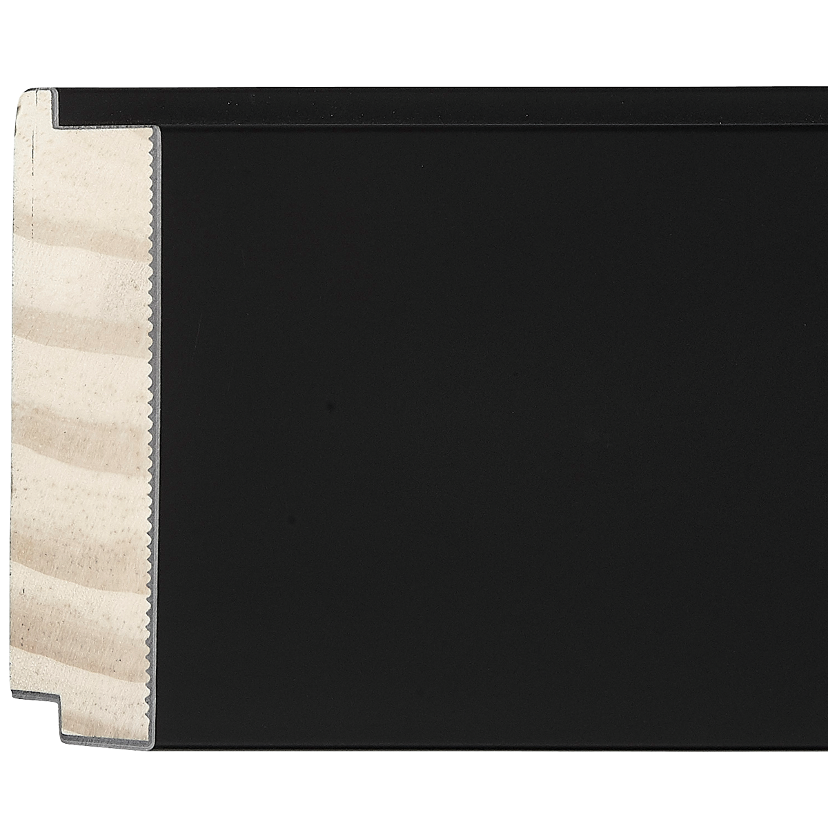
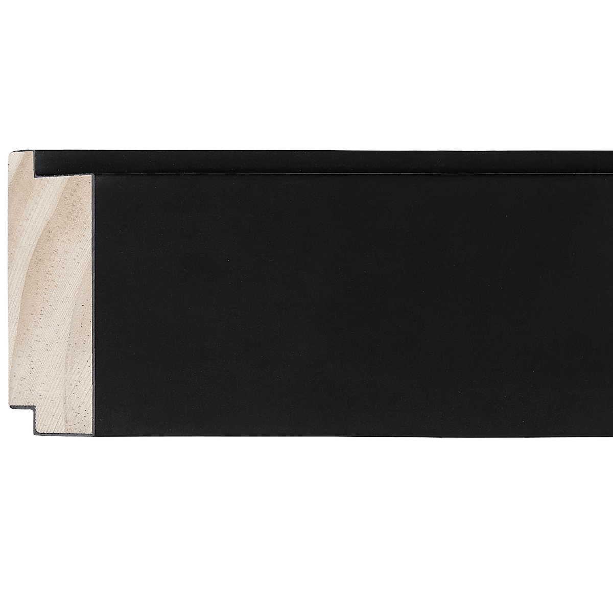
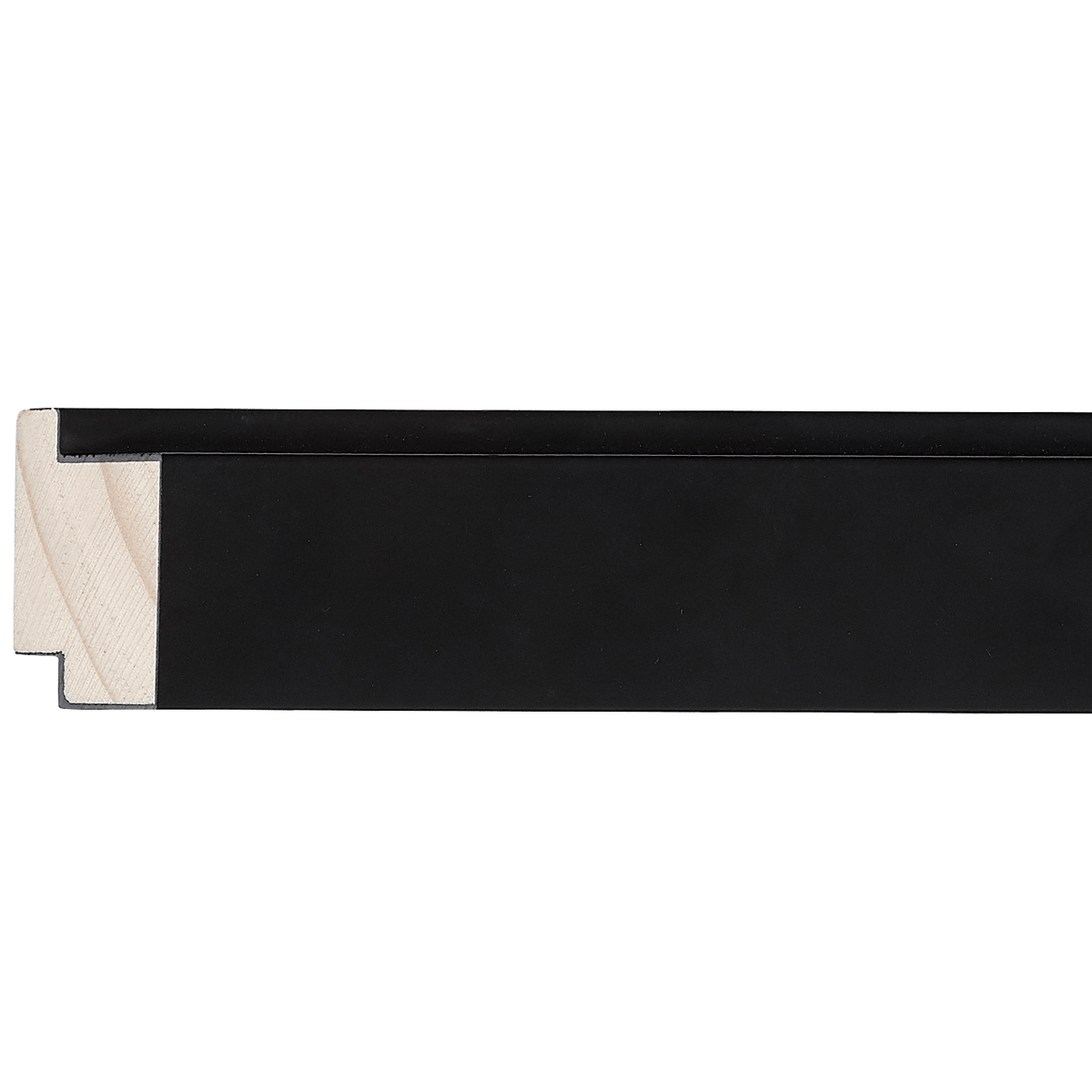
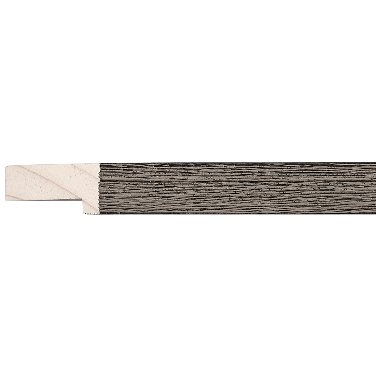
Two Tone Wood Moulding
EZB3403
Contact us for pricing.
Specifications
- Frame number
- EZB3403
- Category
- Moulding
- Material
- Wood
- Color
- Two Tone
- Width
- 3/4"
- Height
- 5/8"
- Rabbet
- 5/16"
- Feet per box
- 836
Easy Signs Inc. · Oakland Park, Florida
Visit our showroomThe perfect pairing
Artwork for EZB3403
It is a pleasure to assist you. As a curator, I often tell my clients that a frame is not merely a border; it is the "architectural bridge" between the art and the environment.
The EZB3403 Two-Tone Moulding is an understated, elegant profile. At 3/4" wide and 5/8" high, it sits in that perfect "Goldilocks" zone: it provides enough structural definition to anchor a piece, but its slim profile prevents it from overwhelming the image. The two-tone finish typically implies a sophisticated play between light and dark (such as a warm wood interior with a gilded edge, or a matte black edge with a metallic inset). This versatility makes it a high-utility piece in any collection.
Here is my professional breakdown for maximizing the potential of this moulding:
1. Art Styles
Because of the two-tone finish, this frame excels in bridging the gap between historical weight and contemporary lightness.
- Modern Minimalist/Scandinavian: The slim profile is ideal for clean, uncluttered aesthetics.
- Mid-Century Modern: The wood element brings the necessary warmth for the organic, geometric sensibilities of the 1950s/60s.
- Contemporary Impressionism: The subtle contrast of the frame echoes the light-play found in Impressionist brushwork.
2. Subject Matter
This frame is an excellent "chameleon."
- Botanicals and Nature: The wood base naturally complements organic textures, making it perfect for pressed flowers, leaf studies, or nature photography.
- Urban Architectural Photography: If the frame has a metallic or darker secondary tone, it will pull out the sharp lines of modern architecture.
- Portraiture: It is subtle enough to frame a photograph or drawing without competing with the subject's face.
3. Color Palettes
To make the best use of a two-tone frame, you should aim for chromatic harmony:
- Earth Tones: If the frame has a warm wood tone, lean into creams, terracottas, sage greens, and deep browns.
- Monochromatic/B&W: If the two-tone is a metallic/black combination, high-contrast black-and-white photography is a match made in heaven.
- Complementary Accents: If the secondary tone of the frame is a gold or silver accent, ensure the artwork contains small "pops" of that same color to create a cohesive loop for the viewer’s eye.
4. Medium & Texture
- Photography & Fine Art Prints: This frame is lightweight and crisp; it is ideal for giclée prints or archival photographs.
- Watercolors: Because the frame is slim, it won't crush the delicate nature of a watercolor. Use a wide, neutral mat (see below) to give the piece "breathing room."
- Mixed Media: If your art is textured, the two-tone finish provides a sophisticated contrast to rougher materials like charcoal or collage.
5. Size & Proportion
With a width of only 3/4", this is a "delicate" frame.
- Matting is Essential: I strongly recommend a double mat for any piece smaller than 16"x20". A generous mat width (at least 2.5" to 3") will prevent the slim frame from feeling "pinched."
- Scale: Avoid using this on oversized, heavy-duty oil paintings on thick canvas, as the moulding is too petite to support the visual weight. Stick to small-to-medium-sized works (under 24"x30").
6. Specific Examples
- The Photography of Henri Cartier-Bresson: The crisp, high-contrast, black-and-white street photography would look exceptional in a two-tone (black/metallic) finish.
- Botanical Lithographs: A classic, 19th-century scientific botanical print would look beautiful in the wood-toned version of this frame, giving it a timeless, museum-archival feel.
- Contemporary Abstract Line Art: Minimalist, single-line ink drawings by artists like Matisse (or modern equivalents) would benefit from the clean, slim lines of this moulding.
7. What to Avoid
- Baroque or Ornate Oils: Avoid using this with heavy, dark, heavily-textured oil paintings that require an ornate, wide "gallery" frame to contain their energy. The EZB3403 will look "lost" against such heavy art.
- Extreme Neon/Pop Art: Avoid artwork with hyper-saturated, clashing neon colors. The elegance of a two-tone wood/metal frame is typically undermined by "loud" contemporary graphics that scream for a thicker, primary-colored frame.
- Float Mounting without a Backer: Because the depth is only 5/8", be cautious with deep-profile canvas stretching. It is best suited for paper-based art or flat canvas boards.
Curator's Pro Tip: When in doubt, utilize a white or "off-white" mat with a thin accent border that matches the secondary tone of your frame. It creates a professional, "gallery-ready" look that will make your artwork look like it belongs in an exhibition.
Keep exploring