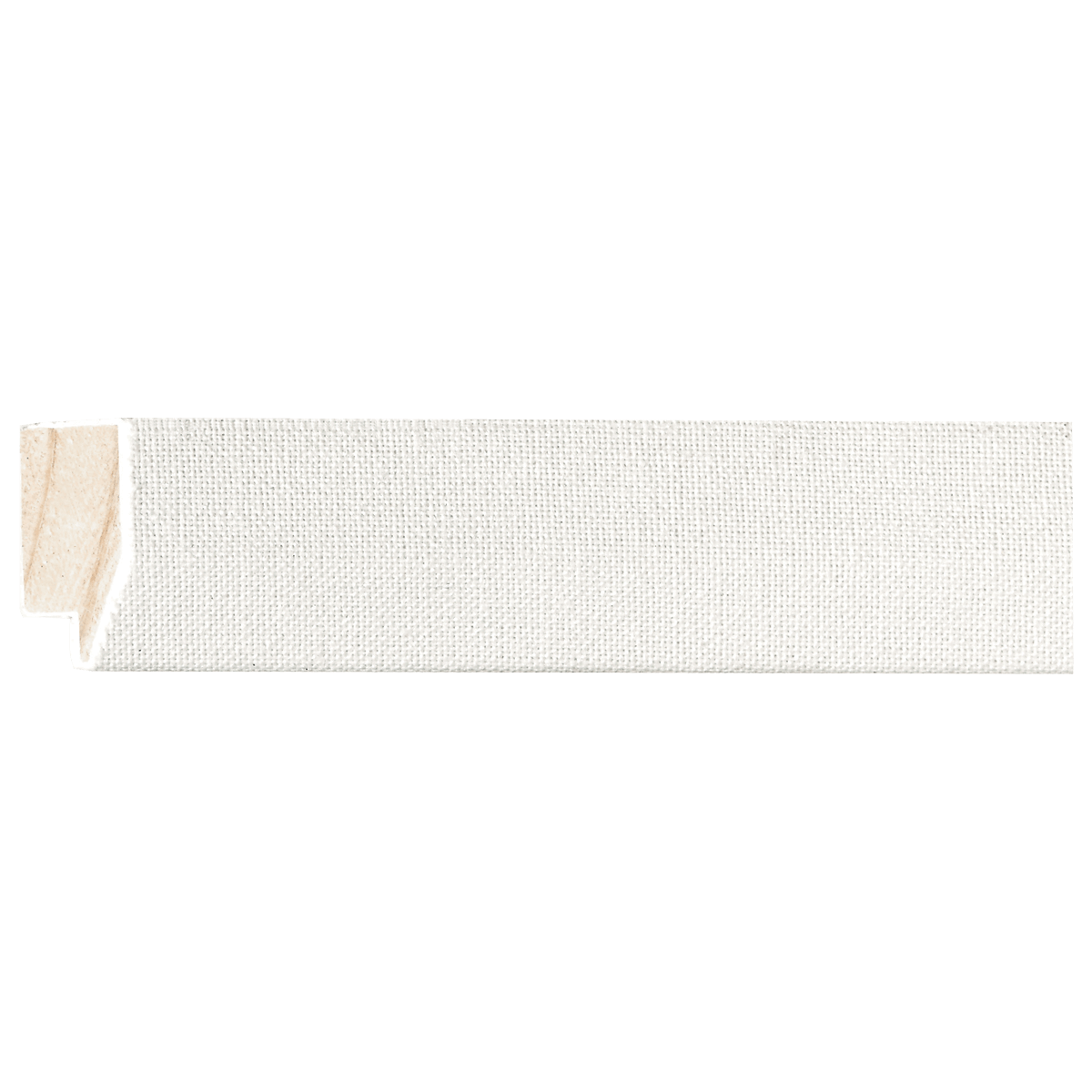
Linen Liner
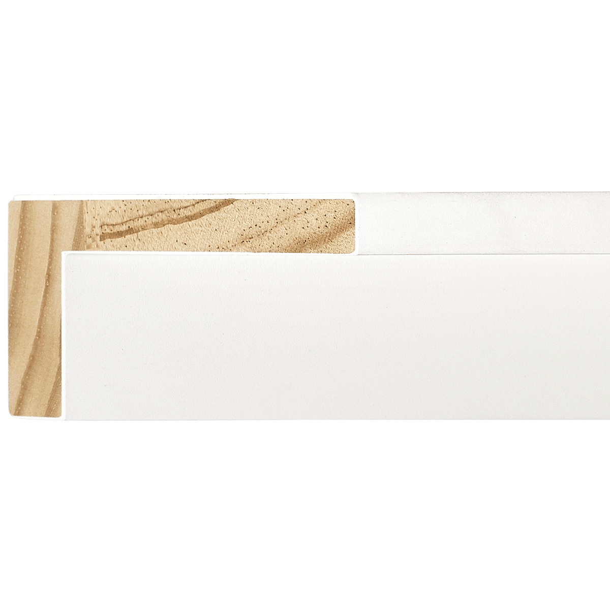
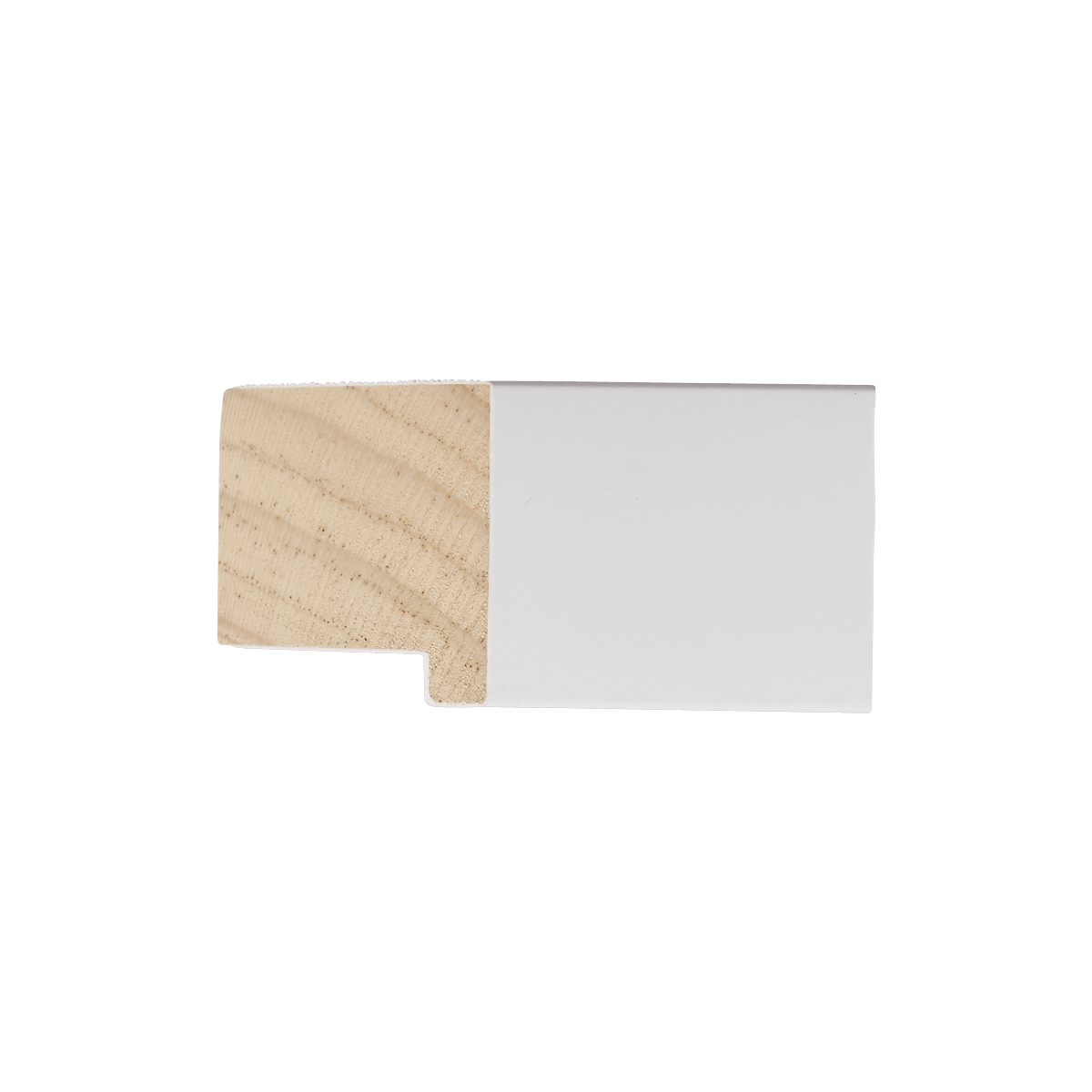
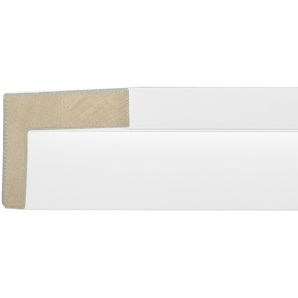
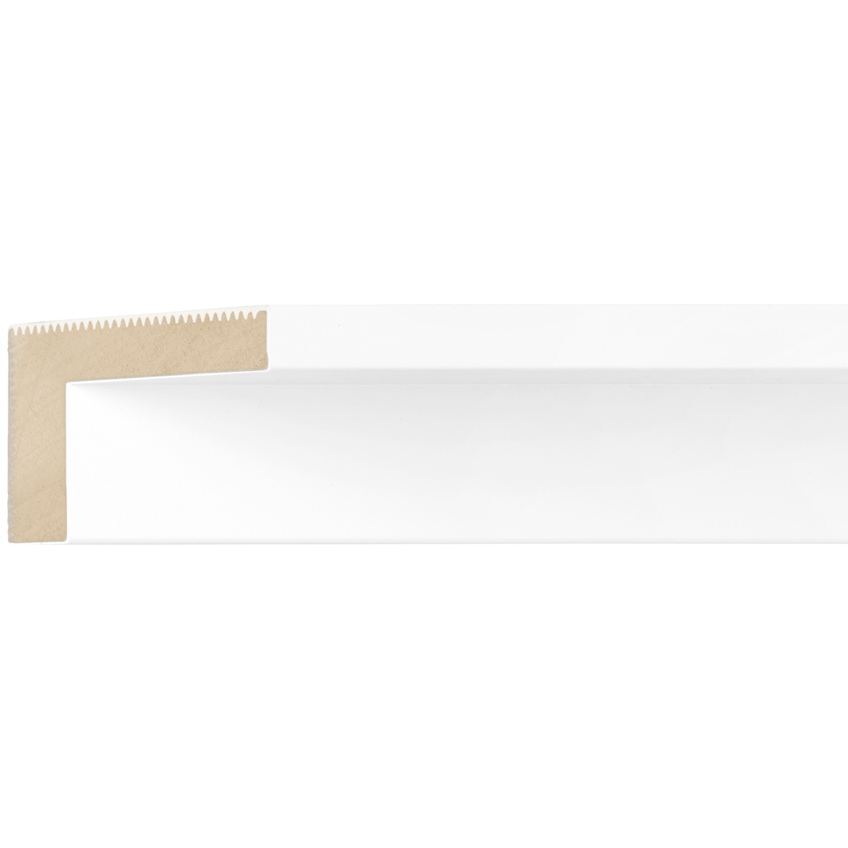
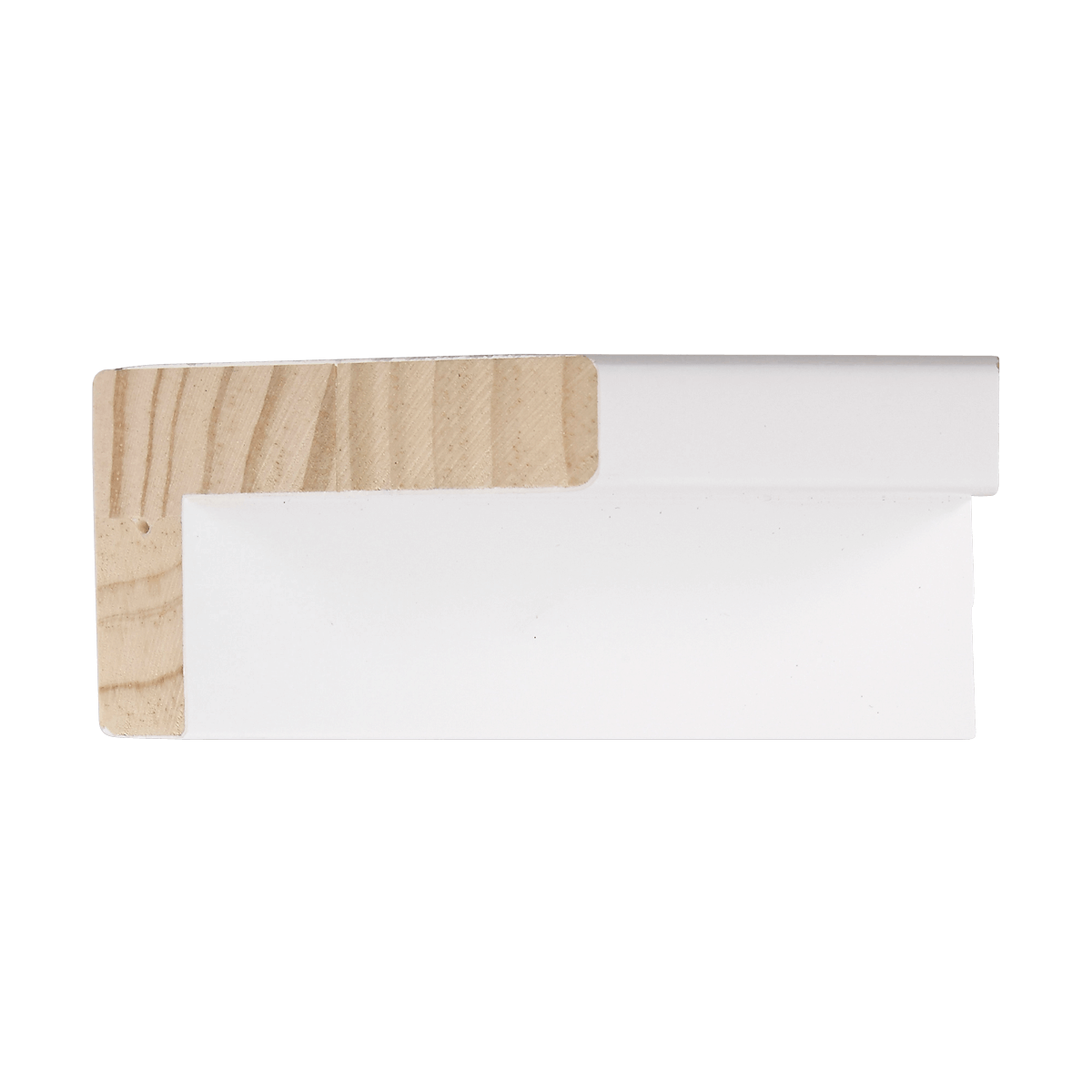
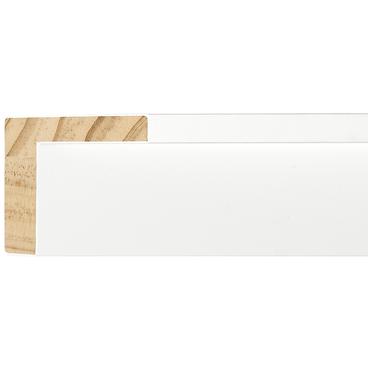
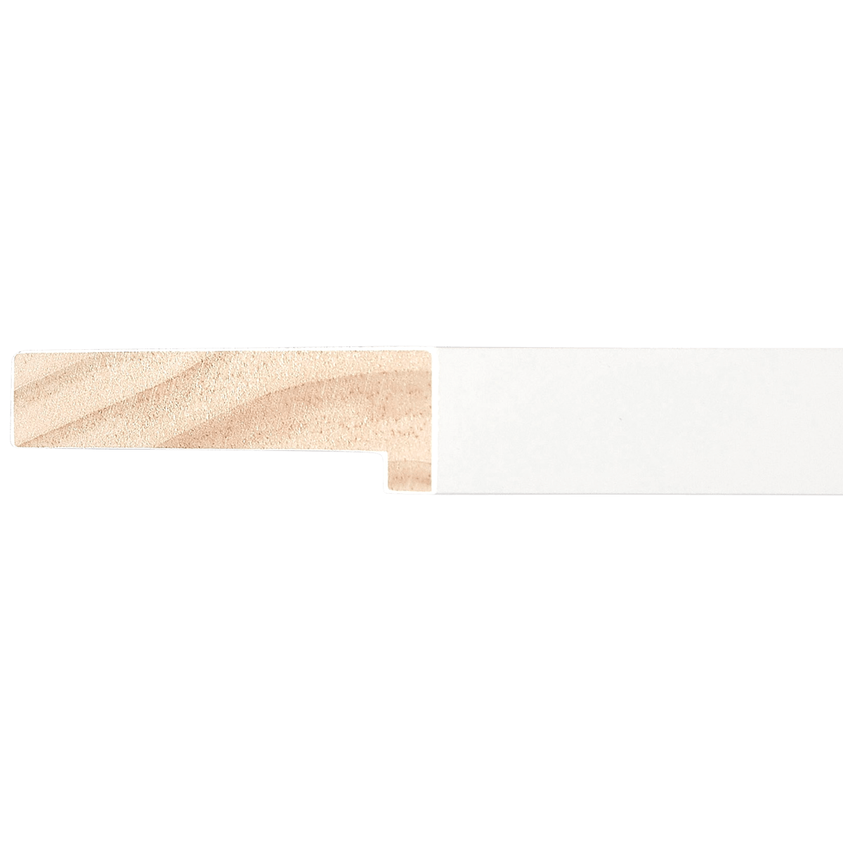
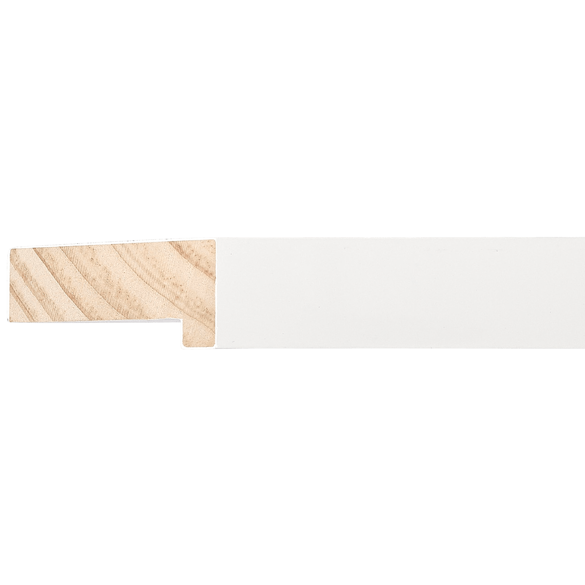
White Wood Linen Liner
EZB4101
Contact us for pricing.
Specifications
- Frame number
- EZB4101
- Category
- Linen Liner
- Material
- Wood
- Color
- White
- Width
- 1 3/16"
- Height
- 9/16"
- Rabbet
- 1/4"
- Feet per box
- 540
Easy Signs Inc. · Oakland Park, Florida
Visit our showroomThe perfect pairing
Artwork for EZB4101
Hello! As a curator, I find the EZB4101 Linen Liner to be one of the most versatile tools in a professional framer’s kit. A "linen liner" serves as a bridge between the artwork and the outer frame, adding depth, breathability, and a touch of gallery-grade sophistication.
Because this specific liner is a clean, crisp white, it acts as a neutral "breathable" zone for the eye. Here is my professional assessment on how to best utilize this piece for your collection.
1. Art Styles: The "Gallery Aesthetic"
This liner is inherently transitional. It leans into a clean, modern aesthetic but carries the traditional pedigree of museum framing.
- Impressionist and Post-Impressionist styles: The texture of the linen mimics the weave of a canvas, making it a natural companion for these styles.
- Contemporary Minimalism: The clean white color keeps the focus entirely on the artwork, preventing the frame from becoming a distraction.
- Mid-Century Modern: It pairs beautifully with the era's focus on organic materials and clean lines.
2. Subject Matter: The Natural & The Serene
Because the linen liner provides a "breathable" quality, it excels with subjects that require a sense of space:
- Atmospheric Landscapes: Think coastal scenes, misty mornings, or expansive meadows. The linen mimics the organic, airy quality of these vistas.
- Botanical Studies: Whether vintage scientific illustrations or modern macro-photography of flora, the linen texture enhances the "natural" feel of the subject.
- Portraiture: It works exceptionally well for softer, more candid portraits, as the white liner creates a gentle boundary around the subject's face.
3. Color Palettes: The Power of Contrast and Harmony
- High Contrast: Use this frame with dark, moody paintings (think midnight blues, deep forest greens, or charred blacks). The stark white linen will make dark colors pop and prevent the image from feeling "trapped."
- Monochromatic/Cool Tones: It creates a harmonious, ethereal look when paired with soft grays, whites, and pale blues.
- Earthy Tones: If you have an artwork rich in terracotta, ochre, or sage, the linen provides a bright, refreshing anchor that keeps the piece from feeling too heavy.
4. Medium & Texture: Texture-on-Texture
- Original Oils and Acrylics: Because the liner has an actual fabric weave, it echoes the texture of a canvas. It is essentially made for oil or acrylic paintings on canvas board or stretched canvas.
- Fine Art Photography: It is an excellent choice for matte-finish photography. It adds a "tactile" quality to a digital print, giving it a more "object-based" feel.
- Watercolors: If you are framing a watercolor, ensure you use a protective glazing (glass/acrylic). The linen provides a traditional, archival appearance that elevates the delicacy of the medium.
5. Size & Proportion: Depth is Key
With a width of 1 3/16", this liner is substantial enough to be seen but slim enough not to overwhelm.
- Recommendation: Use this in a "stacked" configuration. Pair it with a larger, darker outer frame (like a dark walnut wood or a sleek black metal). The linen liner should sit inside the outer frame, creating a "frame-within-a-frame" effect.
- Proportion: This liner is perfect for medium-sized works (e.g., 11x14" to 20x24"). For very small works, it might take up too much visual space; for very large works, you may need a wider secondary molding to balance it out.
6. Specific Examples: The Perfect Match
- Claude Monet’s Water Lilies: A print or study of Monet’s work would look pristine here. The linen reinforces the canvas texture, while the white creates the luminosity needed for his light-filled palettes.
- Modern Botanical Line Art: A simple, single-line ink drawing of a leaf or flower. The linen provides a rich, tactile background that makes the minimalist line work look like an expensive gallery acquisition.
- Coastal Photography: A black-and-white print of a misty, rocky shoreline. The linen adds to the "organic" feel of the print, making it feel like a window looking out into the world.
7. What to Avoid
- Extremely Glossy/High-Sheen Art: A hyper-glossy metal print or a metallic-foil print may clash with the matte, organic texture of the linen.
- Busy/Neon Pop Art: If you are framing a piece with intense neon colors or chaotic, high-energy compositions, a white linen liner might feel too "polite" or "tame." These styles often benefit from starker, non-textured boundaries (like a smooth, flat mat).
Curator's Tip: When installing, ensure the linen liner is perfectly clean. Linen is a natural material and can attract dust; a light tap with a soft, clean brush is your best friend during the framing process!
Happy framing! You’ve chosen a piece that adds elegance and professional polish to almost any collection.
Keep exploring