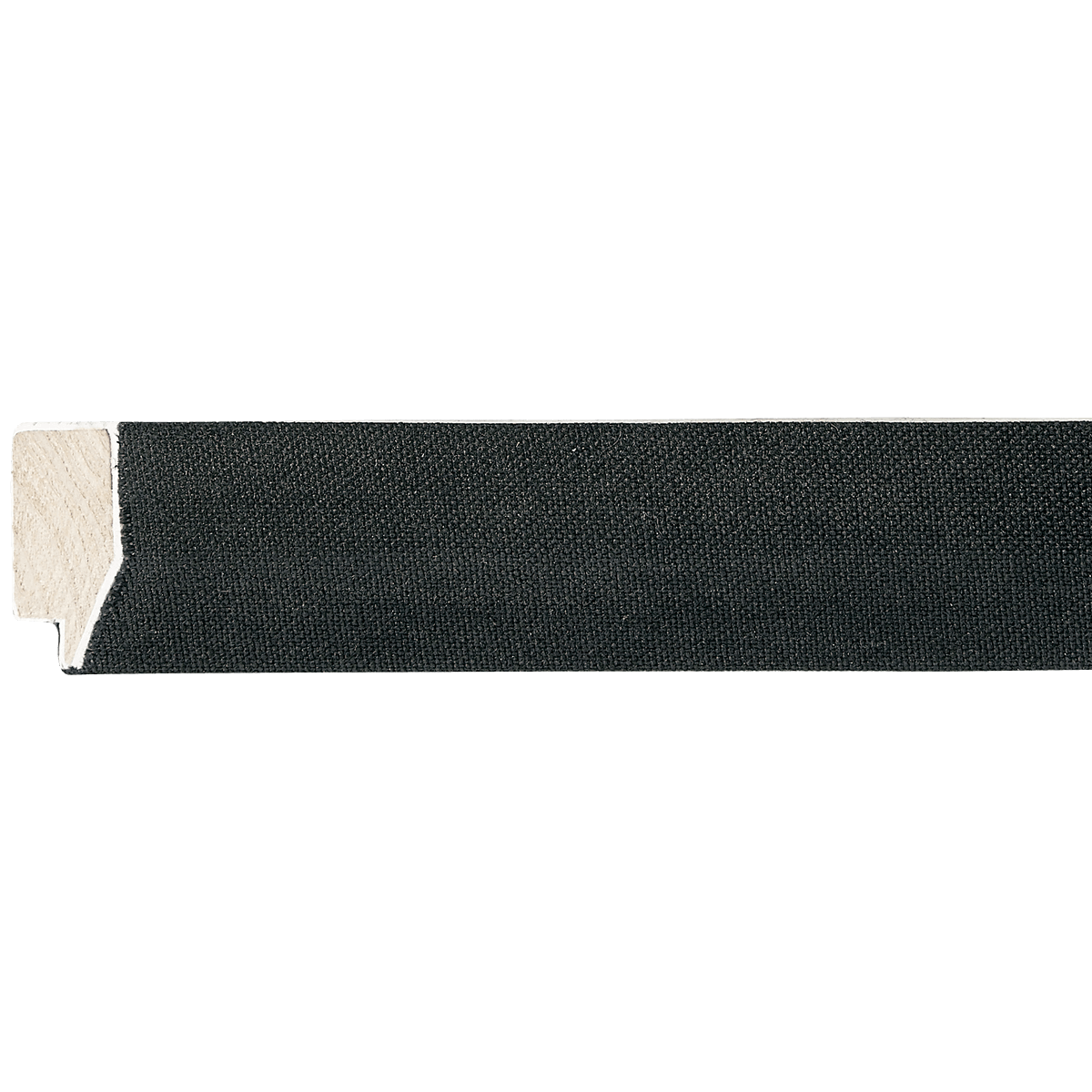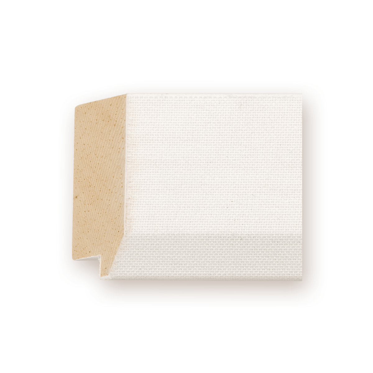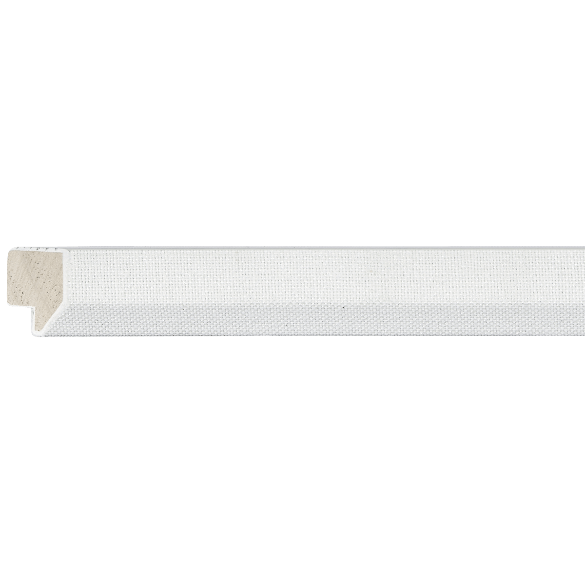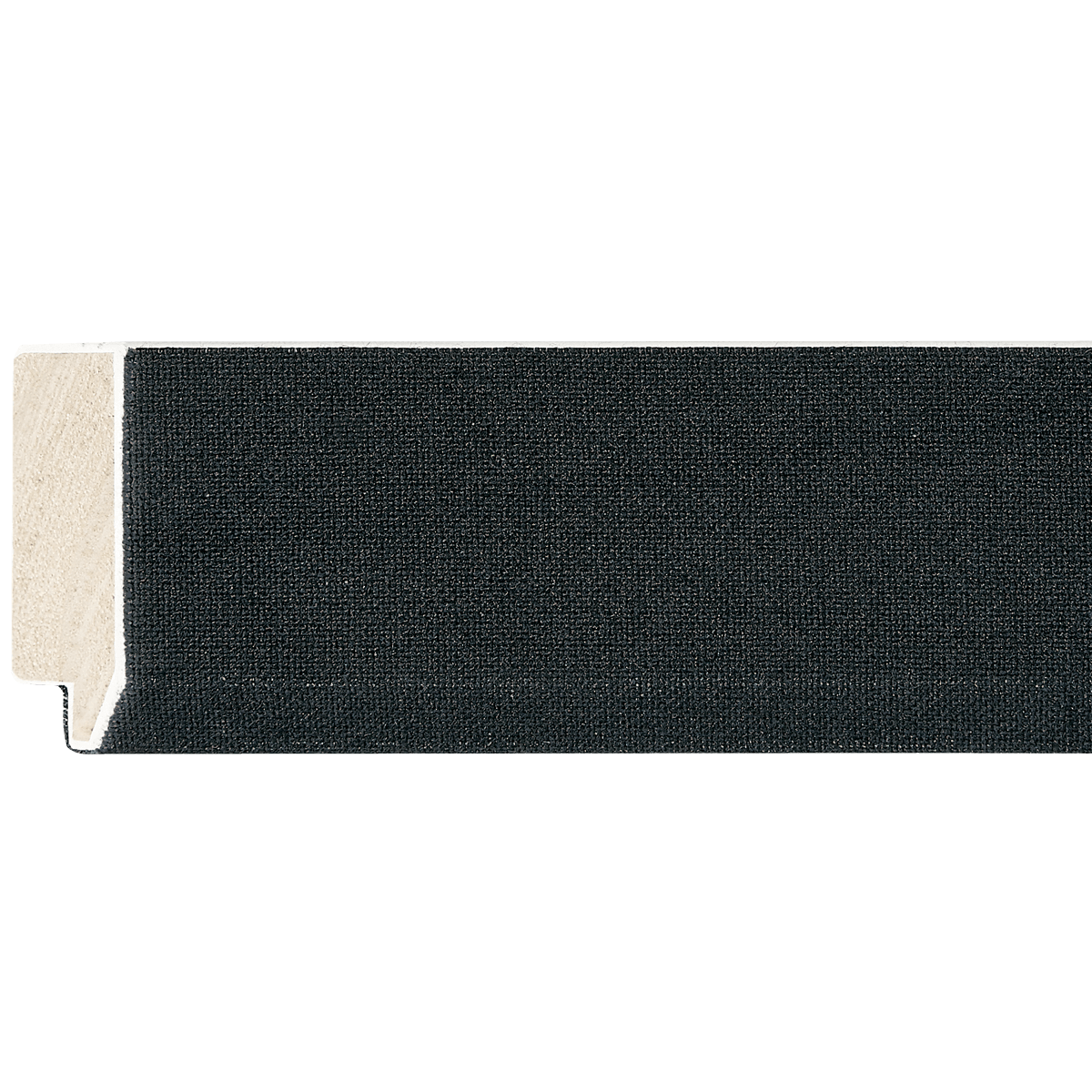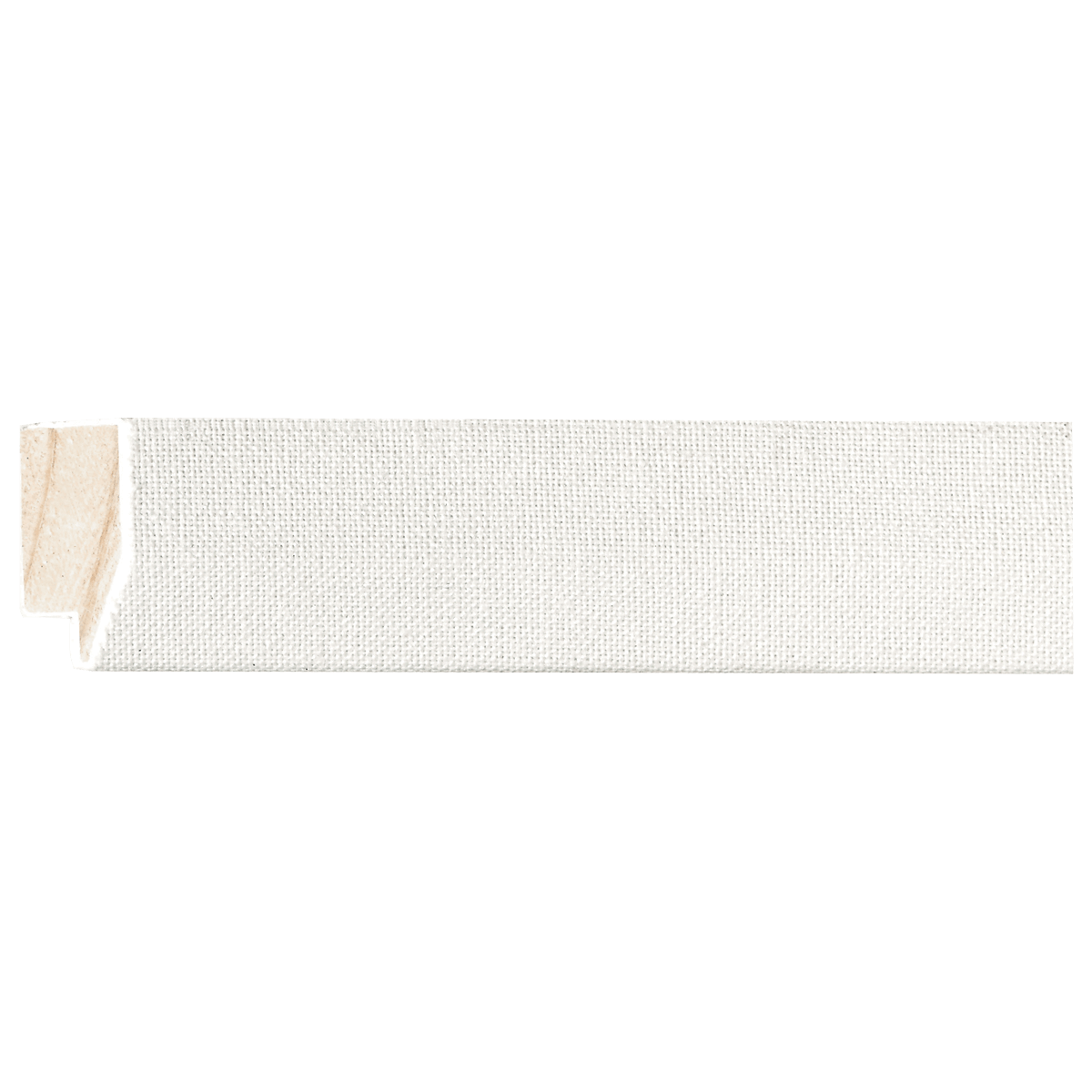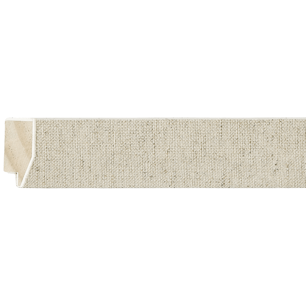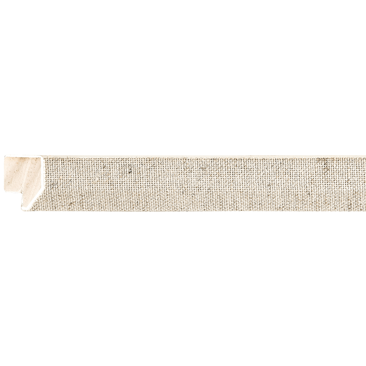
Linen Liner
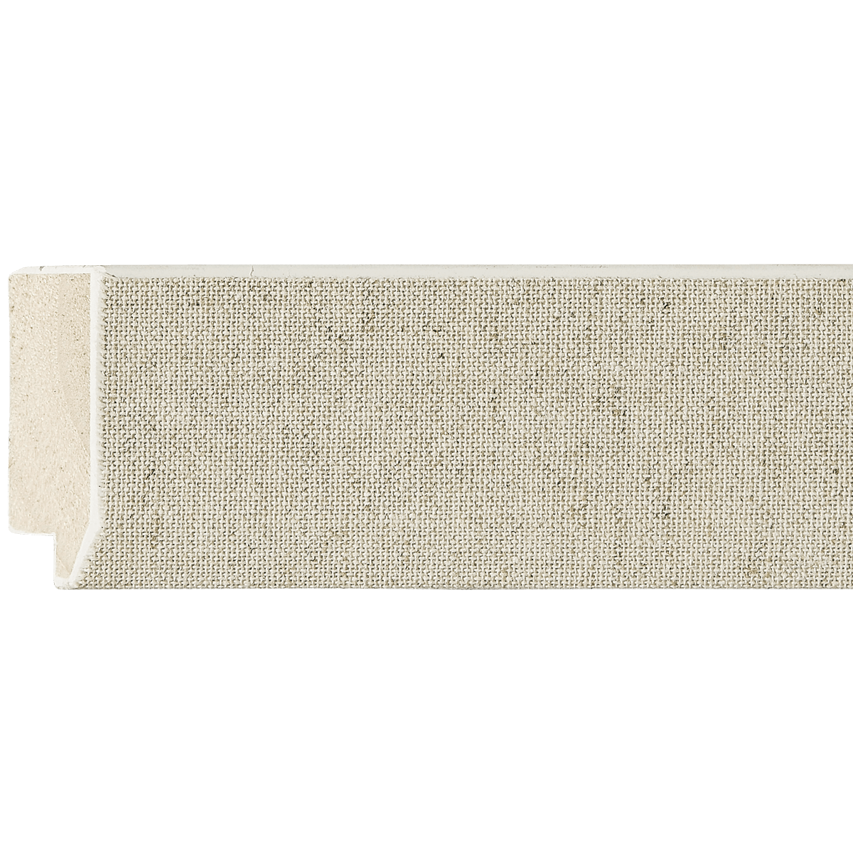
Oatmeal Wood Linen Liner
EZB2102
Contact us for pricing.
Specifications
- Frame number
- EZB2102
- Category
- Linen Liner
- Material
- Wood
- Color
- Oatmeal
- Width
- 13/16"
- Height
- 5/8"
- Rabbet
- 1/4"
- Feet per box
- 850
Easy Signs Inc. · Oakland Park, Florida
Visit our showroomThe perfect pairing
Artwork for EZB2102
As a curator, I view the EZB2102 Linen Liner as a sophisticated bridge between the artwork and the environment. Because it features a textured linen finish in a neutral "oatmeal" tone, it functions similarly to a mat but provides significantly more depth and tactile elegance. At 13/16" wide, it is a "slim profile" liner—designed to provide a gentle, museum-quality transition without overwhelming the piece.
Here is my expert breakdown on how to best utilize this specific frame component:
1. Art Styles: The "Organic-Elegant" Aesthetic
This liner excels with art that feels organic, human-made, or historically rooted.
- Impressionism & Post-Impressionism: It echoes the textures often found in canvas-based works from the late 19th century.
- Minimalist Modernism: The clean, neutral lines allow the focus to remain on the composition.
- Traditional Portraiture: Linen is the classic choice for oils; it provides a soft buffer that makes portraits feel more approachable and timeless.
2. Subject Matter: Nature and Softness
Because the oatmeal color is inherently earthy and warm, it performs best with subjects that share that temperament:
- Botanical Studies: The linen texture mimics the organic nature of flowers, ferns, and botanical illustrations.
- Landscapes: Whether a sun-drenched pastoral scene or a moody, atmospheric watercolor, the oatmeal liner acts as a neutral sky or ground, grounding the scene.
- Figurative Work: The soft texture of the liner contrasts beautifully with the skin tones and fabric textures typically found in figure drawings or paintings.
3. Color Palettes: The Warmth Harmony
- Warm Neutrals & Earth Tones: Think creams, ochres, soft terracotta, and sage greens.
- Muted Pastels: If your artwork features dusty rose, pale lavender, or sky blue, the oatmeal liner will make these colors "pop" by providing a non-stark contrast (as opposed to a bright white mat).
- Monochromatic: A charcoal sketch or a sepia-toned photograph looks incredibly elevated when paired with this liner, as the warm undertones of the linen keep the piece from feeling too "clinical."
4. Medium & Texture: Prioritize the Tactile
- Oil & Acrylic on Canvas: This is the most natural fit. The liner provides a "buffer" between the painted frame and the texture of the canvas.
- Watercolors: Because watercolors are often printed on textured paper, the linen liner repeats that texture, creating a cohesive visual language.
- Matte Photography: Avoid high-gloss metallic prints here; the matte finish of the linen works best with matte or luster-finish paper.
5. Size & Proportion
Because this liner is relatively narrow (13/16"), it is best used as a secondary element.
- The "Double-Frame" Approach: I highly recommend using this liner inside a larger, darker wood frame (such as a deep espresso or walnut outer frame). The contrast between a bold outer frame and the soft oatmeal liner creates a professional, gallery-grade look.
- Scale: This is perfect for small-to-medium works (up to 16"x20"). On very large pieces, this thin profile might get "lost," so consider pairing it with a substantial outer frame if you are working on a larger canvas.
6. Specific Examples
- Claude Monet’s Water Lilies (Prints/Studies): The soft, dappled light of Impressionism is perfectly complemented by the woven, natural texture of the oatmeal linen.
- Vintage Architectural Sketches: A charcoal or sepia sketch of a historic building will feel like a rare archive find when framed with this linen liner.
- Mid-Century Modern Abstract: Works with soft, organic shapes (think Joan Miró or early Rothko prints) harmonize beautifully with the "earthy" feel of the oatmeal linen.
7. What to Avoid
- High-Contrast/Neon Pop Art: The linen liner is "soft" and "organic." Pairing it with loud, neon, or hyper-modern digital art will create a visual clash. The liner will feel too "quiet" for such aggressive imagery.
- Ultra-Glossy Metal/Acrylic Prints: The industrial, high-sheen nature of these modern mediums will fight against the natural, woven fabric texture of the linen.
- Very Dark, Sharp Graphic Design: If the art is composed of stark, black-and-white geometric lines, a crisp white mat is usually better than a linen liner, which can make the edges of the design feel a bit "fuzzy" or dated.
Curator's Pro-Tip: When choosing an outer frame to pair with this liner, look for something with a slight grain in the wood. A wood frame that complements the oatmeal's warmth will make your artwork look like it belongs in a high-end coastal or Mediterranean-style interior.
Keep exploring