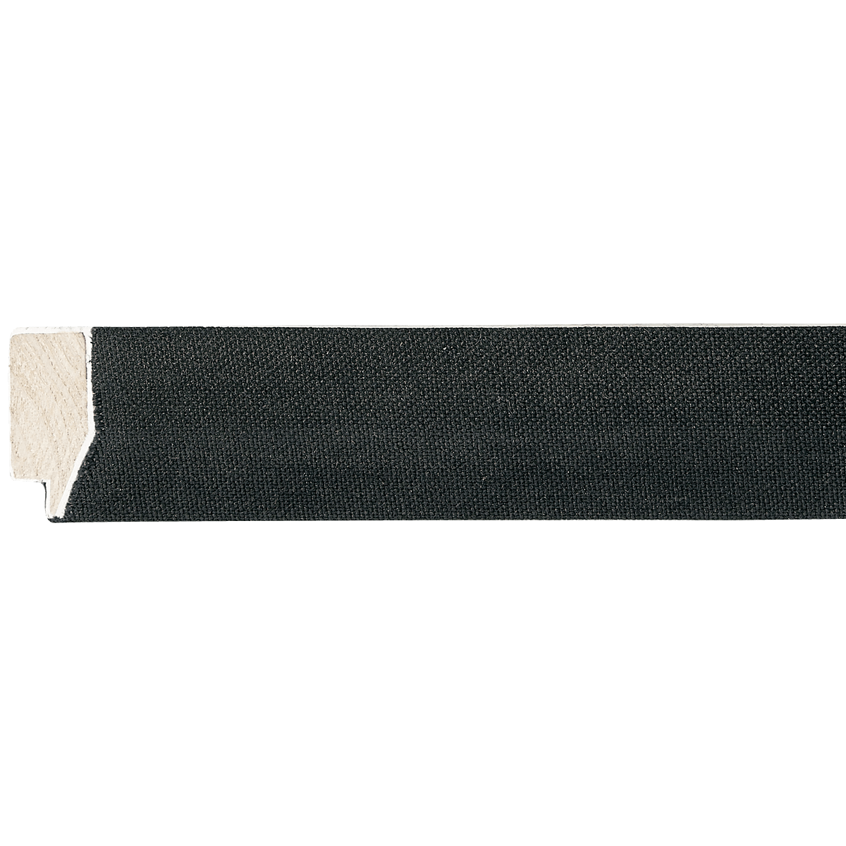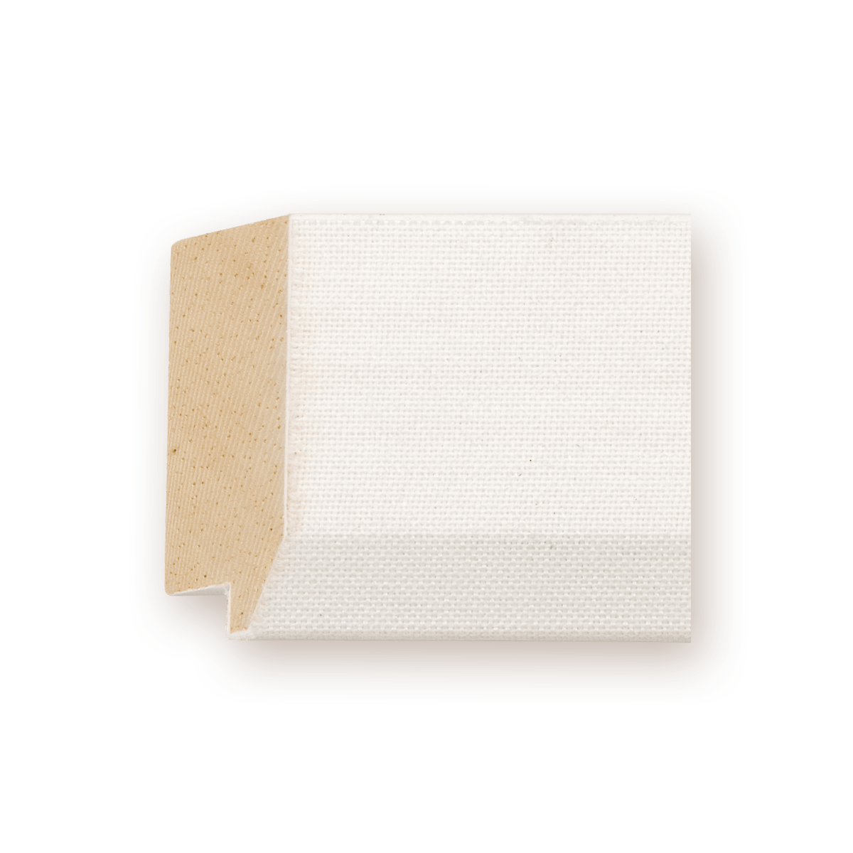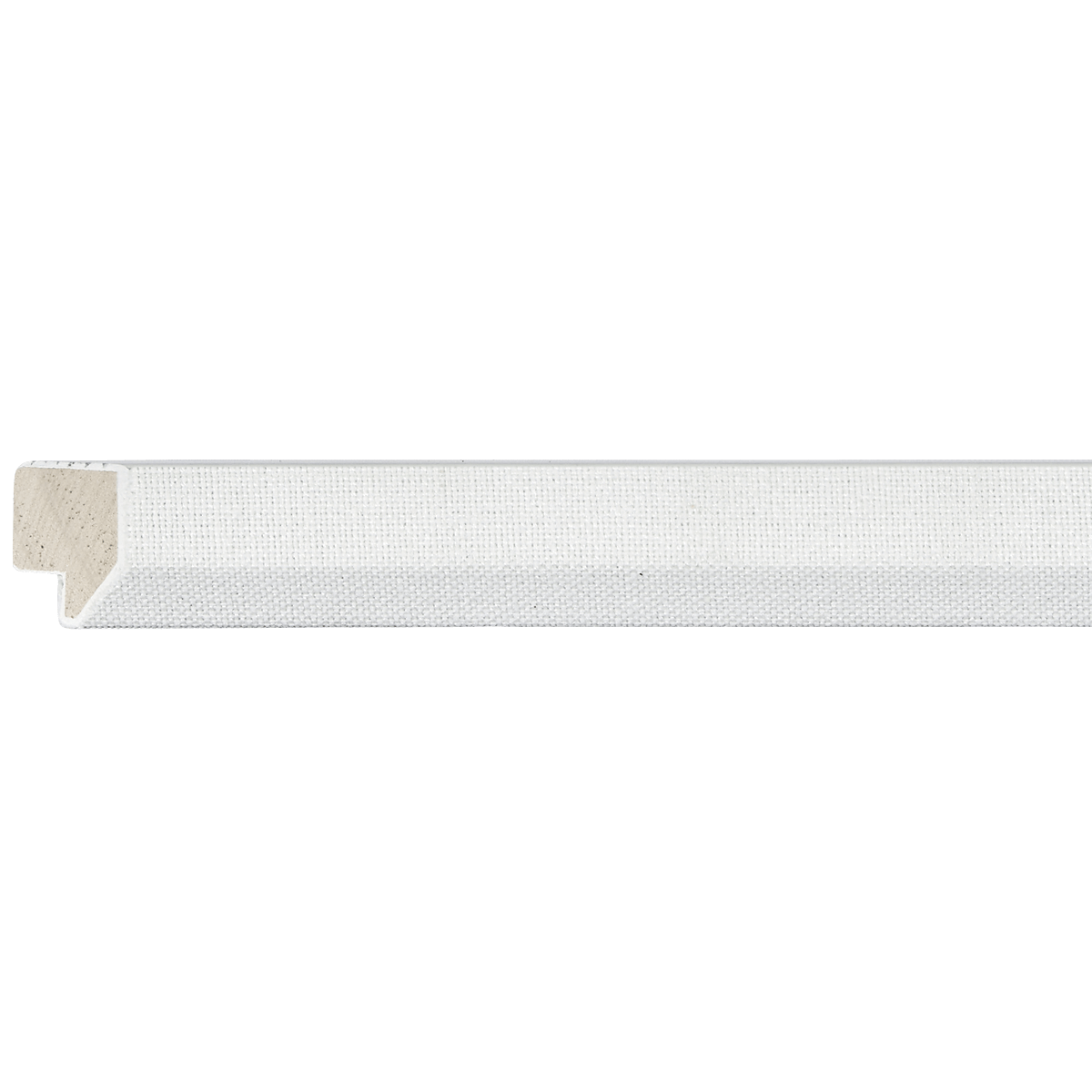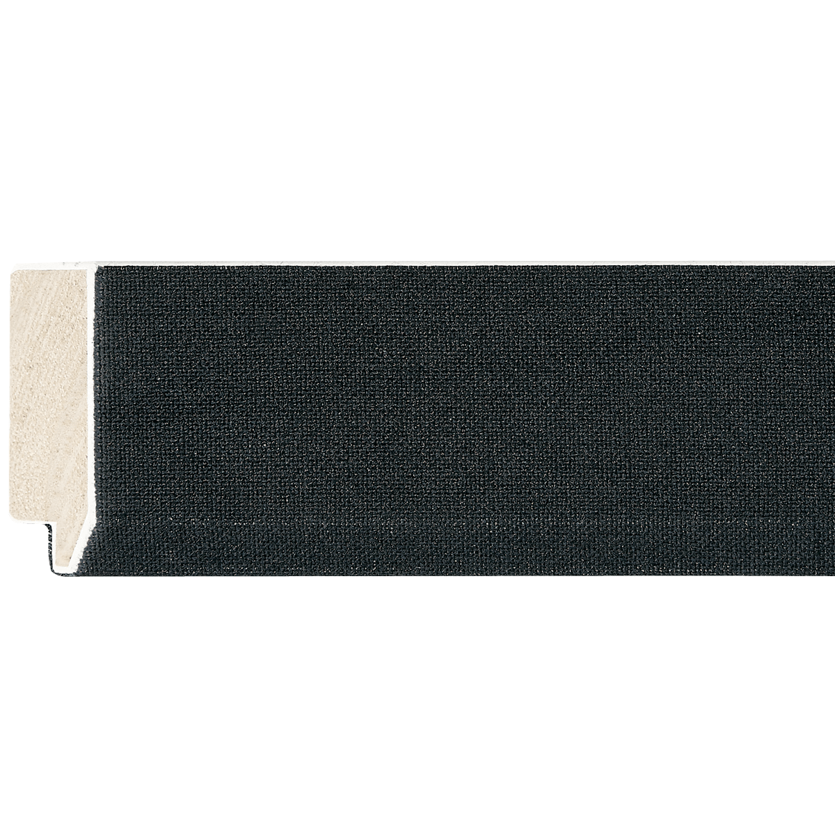
Linen Liner
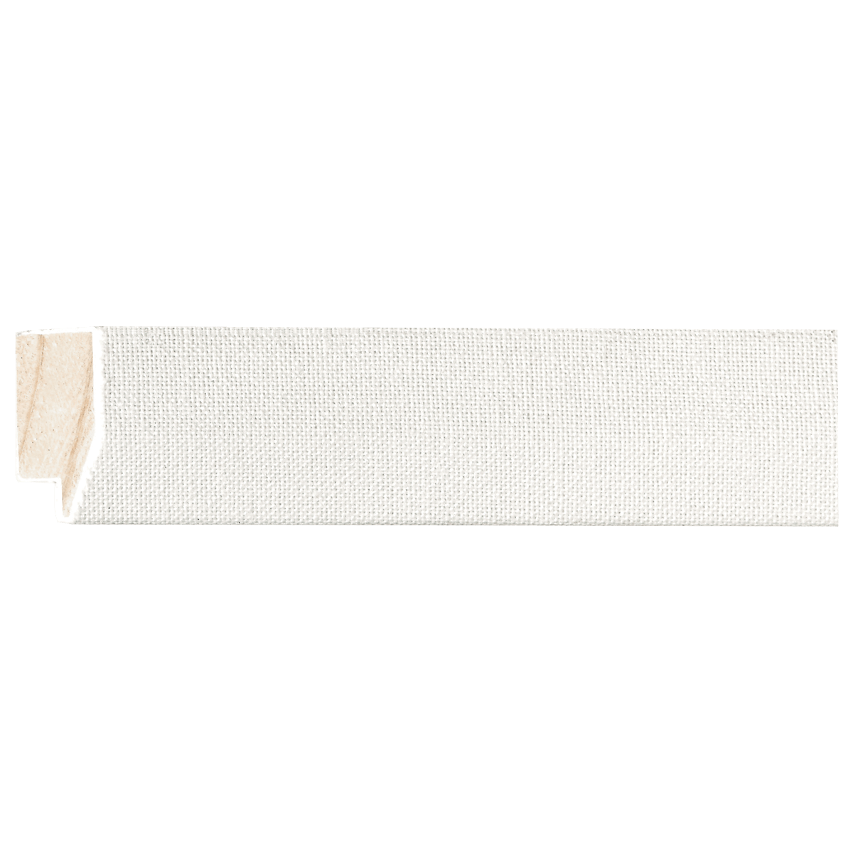
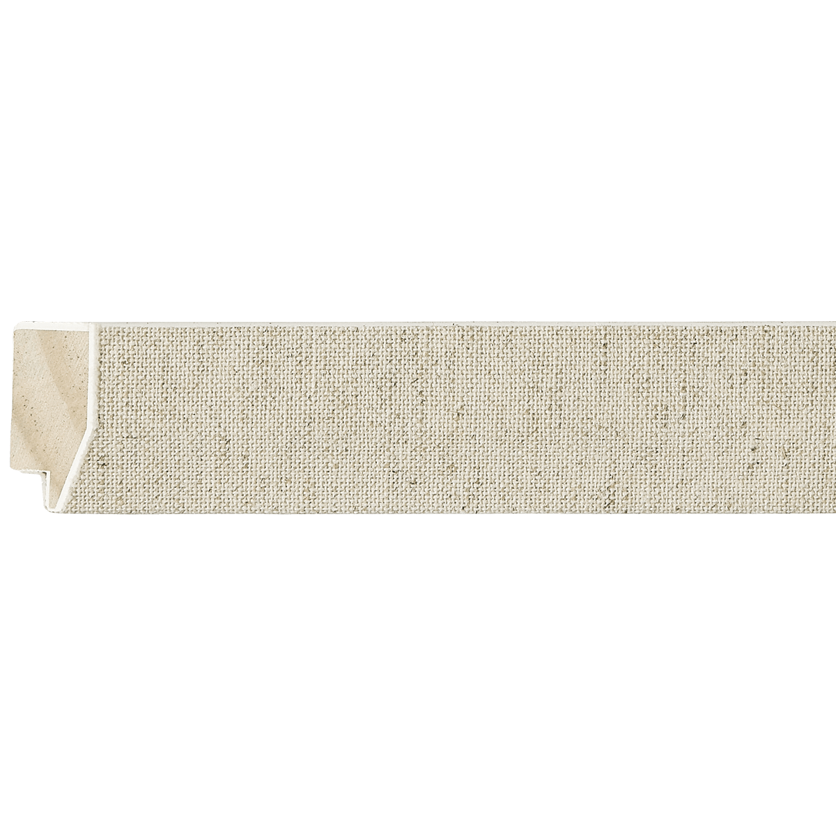
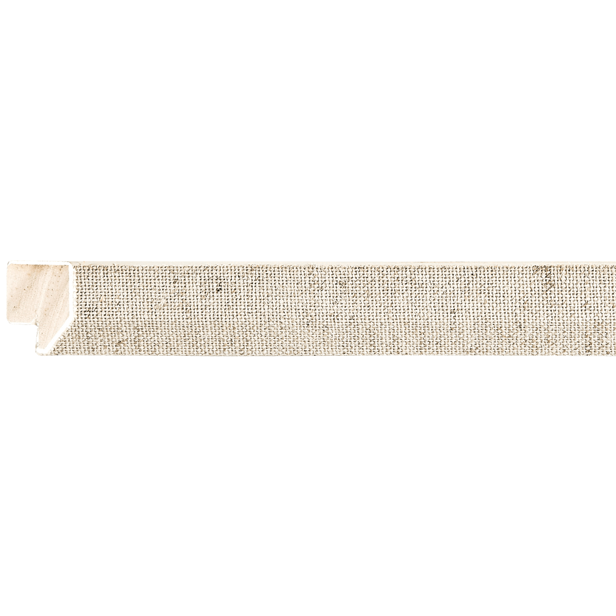
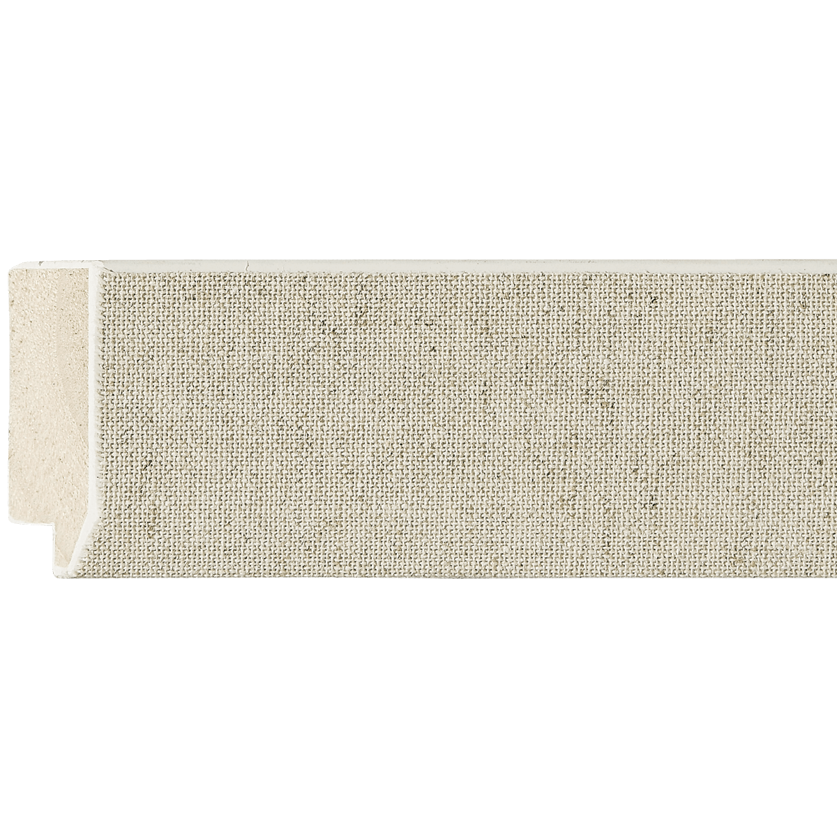
Oatmeal Wood Linen Liner
EZB5102
Contact us for pricing.
Specifications
- Frame number
- EZB5102
- Category
- Linen Liner
- Material
- Wood
- Color
- Oatmeal
- Width
- 1 15/16"
- Height
- 5/8"
- Rabbet
- 1/4"
- Feet per box
- 340
Easy Signs Inc. · Oakland Park, Florida
Visit our showroomThe perfect pairing
Artwork for EZB5102
It is a pleasure to assist you. As a curator, I view a linen liner not merely as an accessory, but as a crucial architectural bridge between the artwork and the outer frame.
The EZB5102 Linen Liner in Oatmeal is a sophisticated choice. Its organic, textured finish and neutral, warm-toned hue introduce a sense of "breathable" space, softening the transition from the wall to the art. Because this liner is 1 15/16" wide, it provides a significant visual buffer that is both elegant and traditional.
Here is my expert curation guide for pairing artwork with this specific liner.
1. Art Styles: Embracing the Organic
This liner thrives in environments that favor depth and history.
- Impressionist and Post-Impressionist: The tactile, woven nature of linen perfectly complements the visible brushwork of these movements.
- Traditional Realism: It provides a "gallery-classic" look that feels at home in a curated, heritage-style space.
- Organic Modernism: If you enjoy minimalist art that utilizes natural pigments, the oatmeal tone reinforces the earthiness of the work.
2. Subject Matter: Nature and Soft Light
The oatmeal hue is inherently earthy, making it a natural partner for themes grounded in the real world:
- Botanicals and Florals: The linen texture mirrors the natural fibers of plants, making it ideal for vintage herbarium prints or watercolor flower studies.
- Luminous Landscapes: Scenes featuring soft, natural light—such as sunrises, overcast coastlines, or pastoral fields—are elevated by the warmth of the liner.
- Portraiture: It works exceptionally well with portraits, as the linen acts as a neutral ground that prevents the viewer’s eye from jumping straight to the edge of the frame.
3. Color Palettes: The Warmth Harmony
Because the oatmeal color is a warm, desaturated neutral, it acts as a "bridge" for various palettes:
- Complementary Colors: It works beautifully with blues and teals. The cool tones of the art will pop against the warm oatmeal.
- Analogous Warm Tones: It creates a cozy, cohesive look when paired with soft creams, terracottas, sage greens, and muted ochres.
- Avoid: High-contrast, neon, or hyper-saturated "digital" colors, which can make the linen look dusty or dated by comparison.
4. Medium & Texture: Tactile Sensibilities
- Oil and Acrylic on Canvas: This is the ideal match. The texture of the paint and the texture of the linen liner create a cohesive tactile experience.
- Watercolors: Because watercolors are delicate, the linen liner provides the substance the artwork needs to avoid looking "lost" on the wall.
- Textured Prints/Etchings: If the paper has a deckled edge or a heavy tooth, the linen liner enhances that artisanal feel.
5. Size & Proportion
The 1 15/16" width is quite generous.
- Proportion: This liner is best suited for medium-to-large works (e.g., 16"x20" and up). On a very small piece, the width of the liner might overwhelm the art.
- The "Double Frame" Approach: For the most professional results, pair this liner inside a substantial wood molding (e.g., a dark walnut or a gilded gold frame). The linen liner should sit between the art and the main frame, creating a "frame-within-a-frame" effect.
6. Specific Examples of Perfect Pairings
- Claude Monet’s Water Lilies (or similar Impressionist works): The linen liner echoes the canvas texture Monet painted upon, making the frame feel like an extension of the artist's studio.
- Botanical Engravings (18th-century style): Pairing a black-and-white or sepia botanical print with this liner creates a timeless, "old-world library" aesthetic.
- Mid-Century Abstract Expressionism: A soft, muted abstract painting (think Rothko-esque) will feel grounded and sophisticated within this frame.
7. What to Avoid
- Glossy, Ultra-Modern Photography: High-gloss, high-contrast, or metallic-finish photography often feels at odds with the matte, fibrous nature of linen. It can make the art look somewhat "hazy."
- Graphic Pop Art: The linen liner is inherently soft and organic; it will clash with the sharp, clinical, and aggressive lines of Pop Art or industrial-style digital prints.
- Deep, Cool-Toned Metal Frames: While subjective, using this oatmeal liner inside a thin, cool silver or black metal frame can create a visual disjoint. Stick to warm-toned wood or gold moldings for the best aesthetic balance.
Expert Tip: If you choose to use this liner, ensure the artwork is mounted with UV-protected glass (museum or anti-reflective glass). Because the linen is a fabric, it is a statement piece—the non-reflective glass will ensure the texture remains visible without being obscured by glare!
Keep exploring